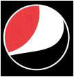
Pepsi For Obama?
 Pepsi just disclosed the new look for their logo as part of a radical $1.2-billion global brand revamp ahead of plans to launch some of its US brands in the UK. According to the company, the idea is to "display emotions", so the new logos portray a series of "smiles" on the packaging across the portfolio. PepsiCo says that the Diet Pepsi logo has a "slight grin", regular Pepsi a "full smile" and that the one for Pepsi Max (up left) expresses "laughter". That's according to them, of course.
I have to say I have a hard time seeing those emotions on the logos. Of course, if you tell me to look for them, yeah, I can find them, but my very first impressions were pretty different...
As with the redesign of the WalMart logo, I am not sure why they are fixing something that wasn't really broke and it makes me go back to the same equation I talked about when analyzing that change. How powerful is the new logo? And more important so, how clear is it when it comes to deliver the idea behind it?
In this case it seems that all the new logos are very open to interpretation.
To start with, the Pepsi Max one looks more near to a martial art sign or to a redesign of the South Korean flag than to a laugh.
But the ones that really suprised me were the other two logos. Maybe it is because we are going through such a political time, but when I saw them and I saw the Obama logo. Check them out:
Now let's take the Regular Pepsi and make a 180º rotation. Then another one, this time a 45º rotation. Aren't we damn close to the Obama Logo?
Bad timming I guess. I am sure this redesign took some time and several rounds to get approved and maybe the Pepsi board has no clue of who Obama is and they were clearly seeing laughs and smiles. Or maybe they wanted to jump in the bandwagon of a campaign that was recently named Advertising Age's marketer of the year for 2008?
Of course we do have to give them the benefit of the doubt. Maybe with a good online and TV campaign we can see the logos "acting", laughing, smiling and expressing joy.
Now, if you think I am the only one "seeing things" here, check what The Denver Egotist has found. In this other case, the first impression may not be related to Obama but to "Joe the Plumber"!
PS: If you want to see the new logos for Mountain Dew and Gatorade, you can find them at Brand New.


4 comments:
i first saw the new pepsi logo yesterday on a commercial
and when i first saw it i thought that it was the obama logo!
i'm glad i'm not the only one to notice this.
however, i think that pepsi made this change intentionally to associate themselves with obama.
It is hard for me to believe that a brand like Pepsi will take such a risk... and on the other hand those changes in companies as big as PepsiCo take too much time, so my feeling is that this was started before Obama was running... but, who knows? (and me too I am glad that someone else noticed how similar the logos look!)
I work for pepsi as a sales rep and have had numerous meetings and "rallys" to talk about the new design and not one time was either the emotions of the cans or the obama sign was mentioned. We were told that it was just a new design to target younger people. To me i think they did it to save money because there is actually less design to the packaging there for ceaper to produce. But whatever i have had a few customers mentioned the obama relation but i didnt notice it until a customer pointed it out to me.
NOOOOOOOOOOOBAMA!
Change your logo Pepsi, you screwed up bad.
Post a Comment