Googleopoly, (E)Bill Gates and Apple Illustrated
 In a time where everyone is talking about the newspapers industry "being hurt" by the online media, few seem to look into what newspapers are doing, or better said, NOT doing to change that situation. Being one of those things making the news or the information more visual.
That doesn't mean that good independent information and deep analysis of the news should not be the central part of any newspaper, but in a society that is becoming more and more visual, appealing to eye-catching images seems like something to be done. And if those images can also deliver the information, much better. Take this work from Norberto (a.k.a. el Norbi) Baruch B., a graphic designer (and academic) that after working some years in advertising went to work for some of the most important Argentinian newspapers.
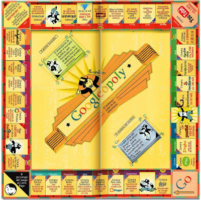
He is working now for another big newspaper "Crítica de la Argentina" and his approach to things -from Google to Apple; from the DNA to Bill Gates-, is a perfect example on how to present information in a visual manner that simply catches the eye. Let's start with his version of Googleopoly....
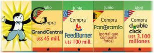
While the idea isn't totally new (there was one attempt from Box.net) his execution is just flawless. The inclusion of Larry Page with tail cot as the Monopoly Guy and the way the illustration really resembles a Monopoly table makes the image immediately attractive. If you add to that the fact that each section shows a company bought by Google with the date and the investment, you have at a glance the information they were trying to showcase: the grow and power of Google. Here, a detailed view:
One that made me laugh out loud was this visual analysis of Bill Gates. From the title already we know its a look to both sides of the man (the businessman and the charitable) but if you don't speak Spanish, here is the catch: "vil" can be translated as "evil" of "vile" but it sounds almost like Bill. So the title "Vil, Bill Gates" was the perfect wording for an image that informs about the guy showing both sides of his story.
There is more from "el Norbi", much more. His take on the story of the DNA's research "a la Da Vinci" is also a great work of art as it is the illustration for a special issue about Guantanamo. Last but not least here is the mandala used to illustrate Apple's development from the first Mac to the iPhone and I found his Dark Vader in 3D almost hilarious!
There is more, much more, from "el Norbi". The good news is that he is also online with his blog about "visual journalism" and even if most of the site is in Spanish, there are good readings in English too, as his interview to Adam McCauley (the one that created the "Monster Stamps", remember?).
Even if you don't speak Spanish, you should check the site: you will find good visual material that you will not see anywhere else!


2 comments:
Nifty. I wonder if the folks at Milton Bradley are pondering copyright infringement.
I doubt it, if they know anything about law and jornalism. This is not a game for sale but an illustration used to show their growth, no infringment of copyrights there.
Post a Comment