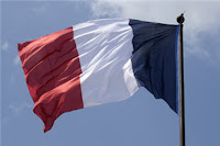
Romney, Ryan, Russia, France and a very expensive ride
 As someone that worked in advertising for almost 15 years, I am picky like hell when it comes to logos. Not picky as clients normally are ("can you make the logo bigger?") but picky in the sense that I want a logo to be simple and yet I want it to be original and I want it to "tell a story" if that's possible.
 Since this election started there was something that was bothering the hell out of me about the Romney campaign logo and I could not put my finger on what was exactly.
Let me be clear, I am not a fan of Mr. Stiff at all (I am a woman and I think, ergo I don't like the GOP ticket) so for a minute I thought that maybe what was bothering me was just his name in there but it wasn't the case. To test myself, I actually stripped that double/triple R from the name and there, alone, that "R" was still bothering me.
Then I saw the logo in another position (thanks Rachel Maddow for having it sideways!) and I start playing with it. By doing so I realized that the very first thing that was "not right" was that the logo reminds me of another flag, not the USA flag but the French flag. Of course, you can say that the colors are the same (and the French flag has them in a different order) but the lack of reference to multiple stripes or to the stars makes the Romney logo more similar to the French flag, with just three equally sized stripes.
 Can you see it? Do you see it?
But that was not all that was bothering me. The blue, that blue, was wrong. Ok, I can go all Pantone into this (and I am not a graphic designer but years of working with them can do that to you) but c'mon, you can tell that the blue in Romney's logo is not the blue of the USA flag, is a watered down blueish.
To be fair, while I still remember how struck I was when I saw the Obama logo for the first time (as it had those three qulities I named before simplicity, originality and was telling a story) I also had a problem with the blue in his logo but in his case the blue was also a sky, so I took it as a "poetic license".
Not representing the sky in the Romey logo, I realized that this specific blue reminded me of another flag..., the flag of the country Mr. Romney considers "America's number one foe", the blue of the Russian flag. Once, again, do you see it?
 Now, don't get me wrong I have nothing against France or Russia (I have been in both countries and I loved them both) but I do find kind of funny that one is not exactly the most admired country by the Romney followers (France) but at the same time was the place he chose to avoid Vietnam while the other one is the one he chose to pin in the map as "America's greatest enemy", going back in time to the cold war and apparently missing what happened with the Twin Towers.
 Still, I knew that was not all that was bothering me. It was the colors and the resemblance with other flags, yes, but there was something else... something...
And then, suddenly, it struck me! I have seen that logo before!! Yes, I have seen that logo before and here it is...
Now...,do you see it?
So I was finally able to pinpoint all that was bothering me: from the three factors that a good logo needs, this logo has just one (simplicity) but it totally lacks originality and if it would be trying to tell a story it would be a story that starts in the wrong country.
On the other hand, you have to give it to the Romney campaign; France, Russia and Rolls Royce seems a good mix for a candidate that loves "dressage", wants to take us back in time and is all about the money!


