Jun 29, 2008

For the Love of Z - A Short Interview

I love the "Z". Is one of my favorites letters and I can give one thousand 'intellectual' explanations of why I like it: because it means "the end" at least in the alphabet; because it represents sleeping soundly when repeated; or because of it's perfect symmetry and shape.

But who I am kidding? Truth is, I am pretty sure that the REAL reason I love that specific letter is because in my childhood I was completely infatuated with "El Zorro" (that original one, you know, Walt Disney, Guy Williams, El Zorro). Even today, if I catch the series on TV, I will stop right there and watch it with a smile in my face.

Anyway... this introduction is to present someone else, someone that has a bigger relationship with the "Z" than I have, to the point that her website is called "I am Z". She contacted me because of my previous postings about business cards, as her site has also an interesting project with her own business cards, cards that by mistake were printed without any title. So she was able to get multiple personalities, and she has now an online collection of some (im)possible titles, as the one you can see below:


I was intrigued by the fact that even her emails were signed "Z" when her name has no z on it. At the time, the business card project wasn't so clear so I sent her some questions, and here is the very short interview:

Why Z?
- Z is my nickname, I am a twin and when we were babies, my sister couldn’t say “lindsey (and hearing lin-z)” she called me “zz” which became “z”

Was your website conceived with so many sections or it grew to what is now, and if that is the case, how it started?

- The website was conceived with many of the sections, z was a way to incorporate anything I was working on in the past, working on currently and can add to in the future when needed and relate to me.

Your business card sections says one thing (that is a project of "cards with typos") but inside there is another thing, your cards with slogans and drawings showing "different personalities". So, what about the original project, is it still the idea? And how come you ended up with your own cards?

- Sorry there is a confusion about what the cards project is, started with and became. Let me see if this makes sense: my first set of business cards came in blank, titleless (this is the “typo”) under my name “lindsey d. sherline” should have been “art director” like most business cards. Well, instead of throwing them away I took it as a creative sign, titles are limited and I am much more than an art director, everyone is much more than their “title” so thought it was an opportunity to connect with people creatively I was working with, give them a blank card to give me a title in their own creative way and also break down any creative barriers that so often block working relationships from the start in the business, that I make fun of myself...does this make sense?

I haven't been in contact with her for a while now, all I know is that she was setting up her own company (that includes a z, of course).

But if you want to see how many titles someone can have, or better said, in how many different ways someone can be perceived, you can visit her business 'cardz' section at her personal site. By clicking on the z's at the bottom, you can see her actual collection and -if you want- you can send her other alternative titles. Here some other examples of what you can find there, but there is much more to see!


Read More...

Jun 27, 2008

It's Friday, Time to Pray or Sin

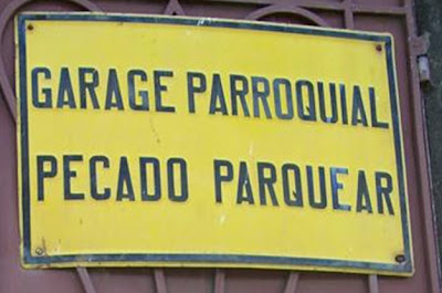
As every Friday, just something to lift the spirits. This time, a sign at the entrance of a private garage, that reads....

No Parking Sign

"Parochial parking.
It's a sin to park here."


Thanks Bi for sending the picture!

Read More...

The Shocking Value

This recently launched campaign from Argentina, called "Without Skin" may look gruesome but it just deals with reality. The title reads "Here is the rest of your fur coat" and as you can guess is against the use of fur for fashion purpouses.

Sin Piel -Click to enlarge
The organization behind the ad is AnimaNaturalis -based in Spain- and the campaign was launched with a street performance, where 50 people in underwear and covered with blood representing the killed animals (see below). As I said before, I tend to prefer subtlety to convey a message, but in cases like this I guess that a direct message works better, getting the attention of everyone.

The street perfomance run for almost an hour and got the attention of journalists and passersby.


While I personally do not agree with the whole vegan movement and I have very logical reasons for that (almost all mammals on the earth kill others to survive, and we are...? oh, yeah, mammals!), I am all for any message that tries to stop the killing or the suffering of animals for reasons like fashion or entertainment. We can and should do better.

If you are interested in the work of AnimaNaturalis, here is their site, but is just in Spanish and as I warned you, they seem a bit fundamentalists in their defense of the animals.

Read More...

Jun 25, 2008

Thinking Out of the Box: A Lesson from the BBC

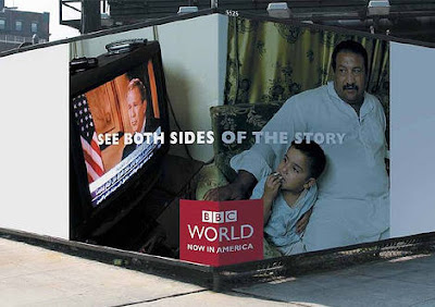
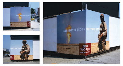
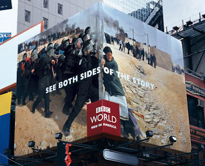
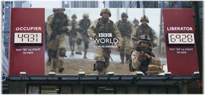
Times Square BBCThese outdoor campaigns from BBC Americas are pretty good examples of two different approaches when it comes to creativity.

While the first campaign -"Corners"- shows clearly that there are always ways to give a creative twist to the "same old, same old" billboard that consists of an image, a copy and a logo, the second campaign ("Interactive") illustrates how much can still be done by creatively mixing new technologies with traditional media.

One is a simple idea that just plays with the location factor, the other is a truly interactive billboard that allows the public to "vote" via texting, and express their views on current political and social affairs.

First, the plain ingenous ones: (click to enlarge)

Bush Irak

Desert Soldier

woman soldiers

The interactive ones, on the other hand, won several very well deserved prizes from the London International Awards (among others). Located in Times Square and with a big "news worthy" image on the center that is flanked by two very different opinions, it entices viewers to decide with which opinion they agree with, using their cell phone to express that opinion.

As the votes come in, two counters tallied up each side’s votes allowing passersby to immediately see the voting opinions what some are calling a 'cell phone democracy.' Here some examples:

China: Friend or Foe?

Beware vs Befriend

Iraq: Wanted or Hated?

Occupier vs Liberator

The agency is BBDO NY and the creative lesson is pretty clear: if you think hard you can always do something new with old formats...or you can create your own format by combining old and new in a different way!

Via & via

Read More...

Cookies, Cookies, Cookies

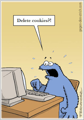
And following up with my previous postings about words and how their meaning may change based on the context and the recipient, here a funny example:

cookie monster

From (originally in German)

Read More...

Cursing in His Honor

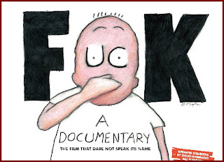
Fck The Movie George Carlin once said “So my name is a footnote in American history, which I’m perversely kind of proud of”.

He was obviously talking about FCC v. Pacifica, the 1978 case in which the Court decided that FCC sanctions could be invoked against a radio broadcast of words dealing with sex and execration, even if those words aren’t obscene.

For those who are not from the the US, the case arose out of a Carlin monologue, played at 2:00 p.m. on a weekday afternoon by Pacifica’s FM licensee in New York, that discussed at length the words shit and fuck. When upholding the constitutionality of the sanctions, the court expressed that : “Patently offensive, indecent material presented over the airwaves confronts the citizen, not only in public, but also in the privacy of the home, where the individual’s right to be left alone plainly outweighs the First Amendment rights of an intruder.” Since then, some words are restricted to a specific time slot and he had a whole special about the 7 words that you can't say in radio or TV.

Now that he passed away, I hope that we can remember him by his lessons, rather than by his legal issues. From my point of view, he tried to teach us something that goes beyond "bad" words, being that lesson "do not be afraid of words".

Me, I am a natural curser. Ninety nine percent of the time I use those words against myself, when I forget about something important, when I make a mistake or something really frustrates me. I rarely use them against someone, mainly because if I want to really offend someone "bad words" are meaningless for me. If I want to offend you or hurt you, I will call you an ignorant, an idiot or a liar, probably because those are the words that would really offend me. So I find cursing a healthy habit: I vent, I get rid of my frustration, I move on.

Words are what you made of them. By themselves they mean very little, maybe what is in the dicationary, but their real meaning is given by the context, the intention and your interpretation.

The right words can enrich any description and a poor use of words can dim any good idea. Your ability with words also says a lot about you (think Bush!) but the truth is that there are no "good" or "bad" words. There are good and bad intentions and good or bad interpretations. Great comedians and good copywriters know about that more than anyone and Carlin was a master in his usage of words. No matter what words he was using, good or bad ones, his main intention was always a good one: he was compelling us to think by ourselves, to analyze things from a different point of view.

And in his honor, I have to say that when I learnt about his death, my first thought was "Shit, why him and not O´Reilly instead?". It really pissed me off because it is so fucking unfair! (sigh) He was a good and bright man. I will surely miss the motherfucker...

You may not like my words but I know he would appreciate my sincerity.

PS: The image at the top is from the "four letter film" a documentary around the f-word in case you are interested.

Read More...

Jun 22, 2008

1984 Redux - Sign of the times

It's impossible not to wonder what George Orwell would have to say about this picture!

Orwell 1984 Barcelona
It was taken in Barcelona, Spain, at the George Orwell Square and as you can probably deduct by yourself the sign reads: "Under surveillance zone in a 500 meters radius".

I love it when the random mix between the old and the new create these "signs of the times"; do you remember the one about evolution?

Via

Read More...

Jun 21, 2008

Doritos TV Campaign - Nostalgia Part II

Nostalgia is a double edge sword when it comes to communication. When it is not well used can make your product or your message look old, outdated or simply grumpy.

But old times is a good place to look for ideas. What have we lost just because times have changed but may still be useful or has its followers? That is exactly the formula behind this hilarious campaign for Doritos from BBDO Argentina:

(Due to the captions these videos don't play well in Firefox, please use IE to watch them, sorry!)


Maybe this campaing would not be well received in the US (how many parents would get all riled up just by the suggestion that teenagers are looking forward to have sex?) but let's face it, is a pretty funny one.

Their whole communication is around the 'benefits' of slow dancing, to the point that they even set up a a special made up website petitioning to get slow dancing back! Here, another spot from the same campaign, this time around the shy guys (or the "slow" ones)...


The "old times" are a good resource for ideas, again, when they are cleverly used. Because they can appeal to a "common past" that unites us all, for good or bad. A message playing with things that we can easily recognize and relate to, -even if we don't want them back- will get our attention most of the time and will probably make us smile, laugh or cry, depending how well that nostalgic touch is being used.

If you have more examples of good ads using the "good old times" as a key component of their message, let me know!

Read More...

Jun 20, 2008

Street Art - They Did It Again!

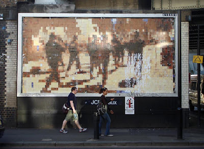
CutUp Collective is a group in England that actually remove billboards to cut them up into small pieces ("pixels") and create new images with them, images that they put back on the streets.

For example, the bus stop poster that you can see here was made from a Spiderman poster -according to Scott Burnham, the Creative Director of the 2009 Montreal Biennale-, who has also spent some time with the group talking about their methods.

But they also take over bigger jobs, like billboards. Last night, they installed their latest work in London, and some of those billboards seem to require an impressive amount of work and careful planning!


I specially like this one, that in some way replicates the urban scene that surrounds it:

CutUp billboard

This other one, that seems unfinished, is impressive too:


Street art always had its special aura but it is interesting to see how lately it has become more and more complex -like in this case or the Blu animated wall paintings-, and has also become more of a collective work than it was before (think Improv Anywhere).

You can see more pictures of their last work at Flickr or visit their site for images of their previous work.

Via

Read More...

It's Friday, Learn French!

I know, you may not be able to learn French in just one day but I found this ad is so funny, that I thought it may be a good way to brighten your Friday.

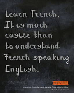
Learn French Ad
Interestingly enough, the ad is from a school in the Czech Republic where they teach just Czech and French.

What can I say? I personally love the fact that the french are proud of their language.

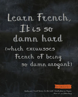
The other ads for the same school are pretty funny too, but I must confess it took me a while to realize that the one with typos is probably mocking the french accent...

Learn FrenchArrogant French


BTW, I know for personal experience that people in France do speak other languages they just really appreciate it more when you try your rusty French before using any other language..., specially English!

Via

Read More...

Jun 19, 2008

Need Fonts?

When it comes to design and fonts, sometimes you know exactly what you want but you can't find it. Sometimes you don't know what you want and you need some inspiration. Whatever your case may be, let me give you some (hopefully) useful information.

Today I came accross "Better Fonts" a very user friendly website offering near to ten thousand fonts for free, some others for $ 4,99 and in what seems to be their sister site Fonts 500, they offer an option to download the top 500 more popular fonts -all of them- for just $ 4,99.

Now, their small print reads: "The fonts presented on this page are their authors' property, and are, to the best of our knowledge, either freeware, shareware, demo versions or public domain. If anyone knows otherwise please notify us. All fonts have been collected from around the web, and are maintained with all files intact" what means you may have a surprise here or there, but still looks like a good place to search for inspiration.

Last but not least, a nice detail: you can change the famous "Lorem Ipsum" for a text of your own to check out how each font applies to your needs.

Read More...

"Creationism" Revisited

I have said this before but I just love the premise... "what if?" because is the perfect trigger for unusual stories. The hilarious commercial below -from Netherlands- is an excellent example of a story of that type..., and the acting is so good that I couldn't help but to watch it twice just to see Eva's face.

I know this idea may horrify some but please spare me of any religious indignation; no matter where you stand on the issue you have to admit that the ad is pretty funny!


While I can't be sure that the commercial aired on TV (a couple of things make me think it may be a spoof ad), this insurance company has a long history of commercials with very imaginative stories, being the one with Clinton one of the most known ones...

...but just in case you haven't seen it, here it is:


The advertiser, Centraal Beheer, is an insurance company usually referred to as "Apeldoorn" because that's the name of the city where they are based. Their agency is DDB Netherlands, and they have so many "weird accidents" in their commercials' history that is impossible for me to include all of them here, but if you search in You Tube for "Apeldoorn reclame" you will find a good share of them!

PS: If you know if the first commercial aired on TV or not, would you let us know?
Via

Read More...

Jun 18, 2008

Using Nostalgia - Part I

This ad was going to be part of a much longer and in depth posting about using "nostalgia" as a resource for ideas. Sadly, because something is wrong with Blogger, each time I tried to post that one I got an error. So I will make this one short and hopefully I will be able to show you some other examples later...

As you will see, this Argentinean commercial for Easy is a clever use of those "old times" that are common to half the western hemisphere. I am sure that if you were watching TV, this mash up of images from a not so distant past will draw your attention to the ad during the commercial break.

The closing reads: "Any great story starts with a house."
And on the truck, "Easy. Your home, your world."


The agency behind the idea is Del Campo Nazca Saatchi & Saatchi. And I bet money that at some point you smiled watching it, just remembering those "old days"... didn't you?

Read More...

Jun 17, 2008

No More Videos for Today

Sigh. I posted the previous article with the TEDtalk and I had another one ready to be published about the use of nostalgia as a creativity trigger... but sadly, when I clicked on 'publish now' all hell broke loose!

Hell being equal to Blogger and "broke loose" equals to -once and again- error message. Cleared files, cache, restarted, nothing. Error, error, error.... Of course I reported the problem already but from my previous experience with support at Blogger it may take more than just one day until someone even acknowledges that there is a problem.

So I hope this could be fixed by tomorrow and that I will be able to make you laugh and think with some Argentinian ads but, who knows? It is all in the hands of the devil..., I mean the techies at Google!

Read More...

Creativity Strangled by the Law

With TED was love at first sight. We met online and just one video got me totally into him... well, it. TED is not a guy but a website, where you can find pretty good "talks" about multiple issues. Not ALL their speakers are great, but most of them are.

Today I want to share the view of a lawyer on the issue of copyrights and how when the law is written or applied without common sense it may end up trying to stop the unstoppable, criminalizing or driving underground things that shouldn't be penalized, like creativity.


Sadly, lately we have seen more and more how corporations try to manipulate the law in -what they believe- is their own benefit.

Just yesterday I blogged about Deutsche Telekom threatening other companies for using the color magenta in their logos. Today, I found out that Tastespotting, one of my favorites sites related to food is closed "due to legal complications", and even I was threatened with legal actions (without any legal base in my case) just for reporting something I saw in another website.

Now, why do I say "in what they believe is their own benefit?". Because in a good number of cases, the only thing those groups or companies are doing is just damaging their brand. In these days news run pretty quickly and a wider backlash from what I call "consumers with common sense" can be set up really fast.

Still, is it pretty clear that we need more lawmakers like Larry Lessig -with real knowledge about new technologies and less "embedded" with the big corporations-, to get better policies when it comes to copyrights.

The same way I believe that politically correctness can hinder creativity, outdated and one sided laws will always impact creativity in a negative way.

As a lawyer's daughter, I do understand that the law should be there to protect basic rights but laws without common sense can be more dangerous than any weapons of mass destruction!

Read More...

What Time is it Now in....?

Finally, someone made a "Time Zones" clock that is easy to use. You can search using the cities/countries in the list or directly by placing your cursor over the map... it will start rotating and you just have to click over the time zone you are interested in. Easy, isn't it?


I got it from Poodwaddle.com and they offer many many other clocks, from clocks for meditation to a "world clock" that allows you to know how may people are being born by the second, the minute, the week, the month or the year, among other interesting things.

They also provide calculators, stats counters, countdown clocks, feedback forms and many, many more tools for free.
Worth a look.

Read More...

Jun 16, 2008

Magenta is Dead, Long Live to Magenta!

Dead MagentaThis is a very strange story even for the branding world.

Deutsche Telekom AG has claimed trademarked rights over the color magenta, -apparently for the T-Mobile brand- and was trying in fact to force other companies to change their corporate logo "due to color infringement".

Most of those companies are based in the Netherlands, but the threat made their way to the US, as they also sent a letter to Engadget mobile for their use of the color.

I really don't know where to start with this one. It is so, so, so unbelievable that it seems like a joke, but it isn't one (here you can see the letter they sent to Engadget).

Of course they pick the wrong fight and half Netherlands first and half the world later, got behind a social movement called "Free Magenta". Designers from all parts of the world sent their illustrations or their thoughts about such a bold move. And while I do understand that companies need to try as much as possible to protect their brand identities, as someone said, "If the colour is so important to a brand, is a weak brand".

Let's face it. It makes all the sense in the world to try to fight SIMILAR logos in the SAME industry with the SAME color. But to fight the use of a color in brands that have nothing in similar except the color, like Compello or SlamFM is absurd. Now, more absurd seems to be the fact that they allowed a company to trademark a color.

As always I don't understand how no one at Deutsche Telekom could foresee that just their threatening would be more damaging to the brand they are supposedly trying to protect, than any use of the color by any other brand!

I must confess I HATE magenta, but that doesn't mean I want it banned or used by just one company. And I simply love some of the creative work that designers have sent to Free Magenta as the one below, sent by Creative Bastards....


Pantone by Brands

I would entitled this pantone, "Imagine".... What if every big brand would trademark their color?
If you are not allergic to such a bright color, take a look at the Free Magenta site, you will find some other good ideas exploring a world without magenta! And if you are interested in the legal aspects of this fight, you may want to read more at ServiceMarks, a blog about trademarks laws in Germany.

As far as I know, Deutsche Telekom already lost a lawsuit they filed against rival European wireless carrier Telia over the use of magenta on its logo but until March of this year, Compella was still trying to avoid a lawsuit: changing their color to a "Red Rubin" that was not good enough change for the Deutche telecom lawyers, according to the last report about the issue by Bloomberg.

Read More...

Jun 15, 2008

Learning Through Games

Almost anything can be learned using some kind of game or challenge and sometimes that is the best way to go.

I still remember -and I am always recommending it to any parent whose kids don't do well in math-, how my love for math grew more by reading "The Man Who Counted: A Collection of Mathematical Adventures"than by anything else. It got me into math by reading (one of my favorites activities) and by challenging me, with its mix between the 1001 Arabian Nights style and the very concrete math problems that are presented there (warning: the English version is not as good as the Spanish and Portuguese one, apparently some chapters were left out).

Now the game I will talk about here is not just for kids. Is part of Engage'08 and basically it allows you to manage the nation budget with pretty good information and then, based on your goals and what you have achieve you get your results and you can even compare them with how others did.

This is how it works: first you have to choose three goals. In my case I chose "efficient government"; "energy independence" and "competitive advantage". Then you can go to each piece of the budget (military, education, etc) and choose the cards you want to play. The cards include things like "cut down 50% of..." or "Increase 50 % of" and sometimes even "Terminate this or that program". Thanks to that, someone like me, "new to the US" was able to learn about some programs in place and work with them towards the results I want.

Once you have played all the cards you want, your results will be calculated and you can see how you have done compared to people with similar goals. As you can see below, my results in my very first try wasn't so bad... I got the deficit extremely reduced, kicking the year for the "Budget Bust" until at least 2070 and I was able to complete two of my goals (and just a little bit of the third).


Funny enough, as you can see, I am a "Downsizer" what I guess puts me slightly in the Republican column but let's get the record straight I am not one. If I could vote I would be an independent. Downsize a government like this is not a matter of right or left but a matter of common sense. You can spend less in some things to spend more in others (like I did) and still get good results.

I think that ANYBODY that votes should play this game to at least understand how complex the budget can be and on how many things you should look for straight answers from the candidates when it comes to policies.

Now, my critique. To make this game more "real" they should include at least a couple of elements that the SimCity game has being those a "popularity" measurement as well as a "catastrophe" element. Those elements means riots when an unpopular measure is taken as well as a random catastrophe that tests how good or bad you are prepared for the unexpected.

In their defense, though, I understand that this game was conceived to be played in minutes while a SimCity type can take days or weeks!

I included the game here (see below) for anyone that wants to play it and leave me their comments. Depending on your browser you may see it or not (is an iframe). If you can't you have right there the link to Engage'08 to play it in the original site.

Again, if you are planning to vote, you should play it at least once!


Link to the game

Read More...

Jun 14, 2008

The voices in my head...

...are telling me that I HAVE to blog about this... (and I think they are right!)

Until recently, if you were "hearing voices" that people near you couldn't, it was almost a certain symptom of some type of insanity.

Not anymore. Now, while walking in the streets you may hear voices talking to you... and just to you, with no one else hearing them except you. But they are not really voices in your head, they are the latest use of "audio spotlight", a technology that allows to direct sound to a very focus point, something you could call "a sound beam".

So far this technology has been used in Epcott Center and the Smithsonian Institute in Washington DC as well as in a couple of Museums but the technology also known as "Holosonics" (that is the name of the company providing the service), has made its way into advertising.

Considering how these hypersonic sound beams work, you can say that your skull becomes the speaker because the sound only becomes noticeable to the listener when the traveling sound waves impact a surface organic or human. The sound resonates against whatever surface they hit... what means that if you are not aware, they may sound like "voices in your head".

A perfect technology to advertise the paranormal. As far as I know, the very first time this technology was used for advertising was when Court TV implemented the technology to promote its “Mystery Whisperer” in the mystery sections of select bookstores but according to AdAge, it has just been taken one step further:

"New Yorker Alison Wilson was walking down Prince Street in SoHo last week when she heard a woman’s voice right in her ear asking, “Who’s there? Who’s there?” She looked around to find no one in her immediate surroundings. Then the voice said, 'It’s not your imagination.' Indeed it wasn't. It was an ad for “Paranormal State,” a ghost-themed series premiering on A&E..."

It is a perfect fit for this case, no doubt. Nevertheless when I think that we are probable seeing the starting point of a trend, some dark thoughts come to my mind, like:

1. What would walking in the city may be if every billboard has something to tell us, and they "resonate" like if those were voices in your head? Wouldn't that make crazy ones even crazier? In fact, wouldn't that drive perfectly sane people insane?

2. While the technology itself has some very interesting and good applications is also being considered to aim targeted advertising directly at the point of purchase, for example the supermarket. How much we can take on that? What would happen if every shelf talks to us?

3. And last but not least... how much this technology can help scam artists in the paranormal field? Or even in the "religious" one? (Maybe one of this is already in the White House and that is how God is talking to George W.?)

I know that our mind evolves and we can take information in ways that we couldn't before. I can watch two TV series at the same time, going back and forward with the remote control, something my grandma's couldn't take. So I have no doubt that we can get used to these targeted messages if they becomes popular, but as with many other things we can't be sure how it may affect us...some of us or all of us. What do you think? Could you take it? Should we?

Via AdAge

Read More...

Jun 13, 2008

It's Friday, Enjoy a Ride!

Great commercial from Euro RSCG in Switzerland for the Zurich Chamber Orchestra. As we say in Spanish, "Bueno, bonito, barato" (good, pretty and inexpensive) plus a great synchro. Enjoy the ride!


Via Dailymotion

Read More...

Jun 12, 2008

The Most Expensive Billboard Is...?

After seeing this video about Times Square I suddenly realized that I don't really know where the most expensive spots in the world are when it comes to outdoor advertising.

(via Gothamist)

At $ 300,000 per month, is pretty clear that Times Square One is one of the most expensive ones out there, but could it be the most expensive one? My guess is that it is not; Trafalgar Square should be a good competition, the same with the Red Square in Russia and the Shibuya intersection in Tokyo, that has been known as the busiest intersection in the world (I have been there and it is really crowded especially at peak hours!)

Now those may be the expensive spots just for placement... what about the most expensive billboard adding up placement AND creativity? My take is that the most expensive outdoor campaign has to be either the Adidas one in Japan...(check the video below)


Adidas in Japan - Vertical Soccer


Or the giant BMW billboard in Moscow (6000 m2 or half an acre of billboard, with real cars on it and not just one!):

BMW Moscow BMW Moscow Billboard

(more pictures of this one at EnglishRussia.com)


Or the Microsoft Vista launching in NYC, kind of a lousy copy of the Adidas one in Japan, but I bet the insurance fees are even higher in the USA:


Do you know about any other billboard that may compete in price with these ones? The one in New Zealand doesn't count, it exploded yes, but apparently it was pretty cheap, around $20000....

Read More...

Jun 10, 2008

Fab and Famous

The use of celebrities is a classic in advertising. Sometimes is risky, sometimes is not. At any rate, who they choose, how they are portrayed and how they are related to the brand in that portrait are the real challenges there.

The Vuitton campaign with choices like Mikhail Gorbachev and Keith Richards has been pretty successfull at using famous in a slightly different way. Now here is their last ad featuring the Coppolas -dad Francis and daughter Sofia-, in a photo taken by photographer Annie Leibowitz.


Vuitton Coppola Ad
I am not terrible impressed by the picture -and I normally love Leibowitz's work- but the main reason I am featuring the ad is because the picture was taken in Argentina, somewhere outside Buenos Aires, my beloved city. I don't know why they chose that location, but it seems to me that the landscape stands out more than the luggage. Or maybe I am just being terribly subjective? (...sigh...)

Via Very Cool

Read More...

Jun 8, 2008

Fostering Creativity in Higher Education - A Study

Today I came across a relatively new study from the European Union about "Creativity in Higher Education".

The project was initiated by the European University Association and was designed to explore and enhance the understanding of the concept of creativity, to identify best practices and produce recommendations on the issue. To that end, the association invited 32 higher education institutions from 21 countries to cooperate during 2006 and 2007 that examined a range of conditions that might promote or hinder creativity in four themes -creative partnerships, creative learners, creative cities-regions, and creative higher education institutions.

Reading the whole study is interesting (or should be) for any educator but also for anyone in business looking for ways to improve creativity inside their company.

I will highlight here some of the things that caught my attention but first and foremost I have to say that I was glad to see that finally the academic world -or at least part of it- is giving creativity the place it deserves: in advanced nations creativity should be a number one issue.

Per their own admission, "Progress towards a knowledge-based society and economy will require that European universities, as centers of knowledge creation, and their partners in society and government give creativity their full attention," says the report, and continues: "If Europe should not succeed in strengthening creativity in higher education, the very goal of a European knowledge society would be at stake."

But the two things that I want to share are their definition of creativity and their key recommendations.

When it comes to define creativity, they made a primary distinction between creativity as a mental process and creativity in terms of the outcome of that process. "It is important that these two aspects are understood as being distinct from one another, because creative ideas or actions do not always yield creative results. Conversely, creative outcomes are not necessarily based on creative processes." I find this first division very important as depending on the circumstances, we may be searching for the process or the outcome.

(...) "Yet at the same time these two dimensions of creativity should be dealt with in an integrated manner. In other words, creativity should be viewed not just as a goal in itself, but should be explored in a manner that links the methods and practices employed to reach certain objectives with the results of these actions."

The groups involved in the project also differentiated among the following dimensions:

- Individual creativity as it pertains to individual members of the academic and administrative staff and students.

- Collective creativity that pertains to the creativity of groups and refers to the successful establishment of mutual understanding and productive collaboration.

- Ethical dimension of creativity: for any processes and/or their outcomes to be considered truly creative in the higher education context, their social and ethical consequences need to be taken into account.

- Institutional creativity, which refers to the conditions promoting creative organizations.

It is easy to see how these four instances can be transfered almost without change into the business world and why they should also be considered by any company trying to foster creativity under their roof.

In order to identify manifestations of creativity, the networks attempted to answer the following questions: When do we know that a creative process is taking place? How can we identify a creative outcome? Which practices at higher education institutions create an environment favorable for creative processes?

Trying to tackle these questions, the groups involved realized that the answers were often facilitated by attempting to define the opposite of creativity. Through this approach the project partners identified the following core characteristics for creativity in the higher education context:

- Originality: creativity is not about reproduction, but entails new developments (that may build on established knowledge) and requires a certain disrespect for established ideas and concepts as well as personal courage.
- Appropriateness: not every novelty is creative, but creativity manifests itself in new approaches that are appropriate to the problem at hand.
- Future orientation: that is, not looking backwards, but being concerned with what may happen in the future and dealing with the resulting insecurity and uncertainty.
- Problem-solving ability: the capability to identify new solutions to problems; this requires “thinking outside the box”, looking at things from a new angle, venturing off the beaten path and risking failure.

From my point of view, to this list we could add some characteristics that we normally find after the fact, that is when the creative idea is already out there. Characteristics like simplicity or obviousness, what I call the "duh!" reaction. Most of the time, when we really reach the most creative solution we find ourselves thinking how come we didn't think about it before.

Now, to their conclusions (bold is mine).

Their 10 key recommendations, as per their executive summary, are:

For the Higher Education Institutions (HEI)

1. Striving towards a creative mix of individual talents and experiences among students and staff, providing common fora for researchers from different disciplines and offering diverse learning experiences will likely result in conditions favorable to the creativity of the higher education community. Structured exchanges between the arts and other disciplines can be particularly fruitful.

2. Diversity within institutions should be complemented with engagement, outreach activities and cooperation on the local level and beyond. Relations with external partners expose the academy to expertise not found within its walls and prevent isolation and self-reference. Cooperation between HEIs and external partners should follow the model of virtuous knowledge creation by aiming towards co-creation of knowledge through a two-way communication process to the mutual benefit of both partners.

3. Any activity of HEIs has to stand the test of whether it fosters the public mission of the institution in terms of teaching and learning, research or service to society. If it does not fulfil these basic ethical requirements, the activity should not be undertaken. Any profits generated by HEIs should be geared towards socially inclusive wealth creation.

4. Universities should look towards the future in all their activities, rather than being grounded in the past. The high level of expertise of the university community in diverse fields uniquely qualifies HEIs to strive towards “being one step ahead” of the times by going beyond established knowledge, questioning time-honoured ideas and trying not only to solve current problems but also be proactive in identifying issues of future relevance. In keeping with this forward-looking orientation, HEIs should work towards developing internal quality processes that support the creativity agenda by being geared towards the future and avoid over-bureaucratisation.

5. It is recommended that HEIs explore the concept of a learning organisation for their management and governance structures. As important as these structural elements are, they must be complemented with ethical and cultural concerns in order to create an institutional milieu favourable to creativity.

6. Students and staff need to be provided with institutional structures and cultures that aim at
balancing stability with flexibility. The human potential of the university should be provided with the safeguards necessary to encourage risk-taking. At the same time, students and staff should be prepared to contribute towards shaping future developments and be ready to address the insecurity and uncertainty this entails.

7. The institutional leadership should embrace its overall responsibility and balance top-downmanagement with delegating specific decisions to staff and students, as appropriate, in order to ensure a wide ownership of change processes within the university community.

For Governments
8. Legal frameworks, funding mechanisms and policy priorities on the local/regional, national and
European levels may exert considerable influence on creativity within the higher education sector. Governments need to be aware of their role in advancing the creativity agenda and the responsibilities this entails. Higher education institutions must be provided with the financial and academic autonomy necessary for acting on the recommendations outlined in this report. Governments should provide the necessary frameworks and support to enable HEIs to base their activities on their values and missions. Specifically, governments should refrain from pressuring institutions to generate profits at any price. In parallel, governments should assess the degree to which the legal frameworks encourage entrepreneurship in the private sector and encourage banking and other financial institutions to support the creativity agenda of higher education.

For quality assurance agencies
9. Quality assurance agencies should be aware of the potentially detrimental effects of external quality mechanisms if they stress conformity over risk-taking, are oriented towards the past rather than the future and develop into burdensome bureaucracies. QA agencies are invited to explore jointly with higher education institutions how external quality mechanisms may strengthen creativity. The ultimate objective would be the development of quality systems which foster the creativity agenda. This means placing enhancement and an institution’s capacity to change at the heart of the evaluation process.

For external partners
10. Higher education and other sectors of society have long existed in separate spheres. Consequently, there is a mutual lack of knowledge. Awareness on both sides of this shortcoming is the first step towards appropriately addressing this constraint and overcoming it. External partners are invited to cooperate with higher education institutions on matters of common interest, leading to mutual benefits and in keeping with academic values and missions.

Now, while these suggestions seem useful for the US educational environment too, the fact that a good share of HEI have become more "a business" than anything else plus the current political environment in this country may hinder the implementation of some of these recommendations.

Last but not least, if you wonder why at the beginning of this posting I said that "in advanced nations creativity should be a number one issue", the reason is simple. From my point of view less advanced nations do have less problems to foster creativity. Their number one issue is the lack of means but this same lack of means tends to increase creativity among teachers and students. It still holds true that "necessity is the mother of invention".

The whole study (in PDF format) can be found at the EUA's website.

Read More...

Jun 6, 2008

It's Friday, Listen to Something Different

Friday is relax time for me. I hope is the same for you and to help you smile and relax is why we started our "It's Friday" section. This time the invitation is just to listen to this incredible voice


The song's name is "Dream of Gardens", the charming voice is Olga Nunes, the lyrics are from Neil Gaiman (someone that you may know already from his books or his comics) and the video was directed by Joey Ciccoline of Team Genius. Enjoy!

Via Fabulist

Read More...

In My Own Private Cloud...

cloud logoRemember the rocking chair? As far as I know that was a prototype that (sadly) never reached mass production.

But not everything is lost. In fact this product (that is available!) seems as good or even better than the chair. Yeap, it is a bed -or sofa, whatever you want to it to be-, to rock your world.

But one of the things that I like the most about it, is its name: Private Cloud. Being someone that spent most of her early childhood 'in the clouds'(but they were my own private ones), I would have no problem in getting one of these and to go back to that feeling...

Cloud Bed

To make things mroe interesting, they have a base that allows you to have it in a fixed position and not necessarily in a complete horizontal one.Cloud with base

So far the only problem -at least for me- is the price. They seem to go from 4500 to up 6000 euros and as I would use this as a second bed it seems a little steep. And I am not sure the price includes shipping and handling.

But if you want one, they are made in Germany by the Kloker brothers and in their website (just in German so far) you can see more pictures, specs or contact them.

Me? I am going back to my clouds, so far they have served me well and for free!

Read More...

Jun 5, 2008

Portuguese Creativity

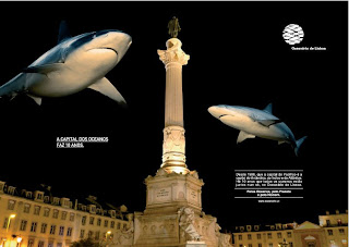
Oceanario Portugal- Click to enlargeOne of the great things of this 'online word' is the fact that we can -if we want- broad our horizons.

And that is a key factor for creativity: the more you see, the more you are able to combine things in a new way.

Today I trip over a blog dedicated to advertising in Portugal -and even when I am not proficient in Portuguese-, one of the things that good ideas have is that they tend to be easy to understand, no matter the language. Not always of course, but in this case with just the titles you can get the idea.

The first two ads that you can see here (the one at the top and the one below) are ads celebrating the 10 years of Lisboa Oceanarium. Is a simple idea very well executed by the art deparment of Lowe advertising. They just mixed some of Lisboa's historical places with the animals that can be found in their Oceanarium.


Oceanario Portugal- Click to enlargeThe copy reads: "Since 1998 the capital for the Atlantic, the Capital for the Pacific and the Capital of the Antartic. For 10 years, all the oceans meet in one place, Lisboa Oceanarium."

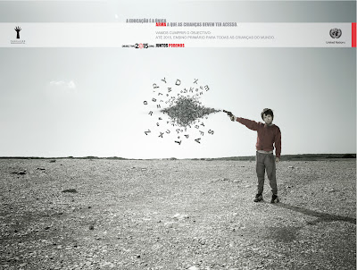
The next ads are part of a campaign for education. One of the goals of the United Nations for this millenium is to get primary school education for all the children in the world, and these impressive ads are reminding the public about that obejective.

Piece: Guns
Title: Education should be the only weapon that kids should have access to.

Arma - Click to enlarge

Piece: Tools
Title: Education should be the only working tool that kids should have access to.

Working tools - Click to enlarge

The agency in this case is MSTF Partners and I find their mix of words and images pretty compelling. What do you think?

Source: O Nosso Portfolio

Read More...

Jun 4, 2008

And the Best Logo Won!

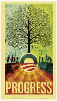
Your Won Obama LogoYesterday night Obama finally won the democratic nomination. I am not going to enter in the political part of it -who I like and who I don't-, I am going to keep it in the realm of communications.

In that sense, in my humble opinion, Obama has shown clearly that he is a charismatic figure, while Hillary went more for the storyteller type, without having the warmth that a good storyteller needs to enchant new audiences. Either she was ill advised and she took that advice anyway, or she believes she can be something she is not.

But let focus on design. I can't recall when was the last time that I have seen such a nice logo in a political campaign. I can't be really sure why, but most of the logos for the political candidates are plain and nasty. Basic design, obvious ideas. I have the feeling that one of the reasons is because they just don't think it is too important. And they are right, the logo should not be more important than their ideas, but as it happens with a tie or a nice dress, it never hurts to have a good one. Now what makes a good logo good?

Better said, what makes Obama's logo so great? Well, it was able to reinforce the 'brand' (his last name) but at the same time was able to simbolize his main message (hope) with very simple lines. It is clearly very symbolic.

Albama for Obama Thanks to such a good design, I have seen his logo morphing into Kids for ObamaANYTHING. From the "Kids for Obama" to "Obama Pride" and the logo fusing into each State name, the work of his people in the design area has been awesome and the simplicity of his logo helped getting others -just followers, not people from his official entourage- to play with them, from Logobama (where you can upload a picture to make your own O. logo) to rock concerts posters. Here some examples:

Dave Matthews Concert Poster


Artists for Obama

Scott Hansen Shepard Fairey


Enviromentalists, People of Faith and Native Americans

Now I have to say that the idea for Ron Paul wasn't so bad. It was a good starting point. From my point of view it needed a simple tweak to become a great logo.

That very very simple tweak could have been to take out the Ron Paul over the word revolution and just leave the word, highlighting the Ron that revolution includes. Something more in the lines of REVOLUTION or RevolutiON (just, you know, better executed!). Ron Paul was more a revolution that love... love may be what his followers feel for him, but his message is not about love (well. maybe love for the Constitution but is a long stretch). The Ron that you can find hiding in Revolution would have been simpler, more symbolic and easy to use.

As with the Obama logo, a tweak like that would have reinforced and fused his name and his message in a better way.

If you want to see more tweaks to the Obama Logo, you can also visit the "people" section in his website or check in NotCot other things that are out there.

Read More...

Jun 3, 2008

It's Never Easy (With Few Words)

When it comes to advertising, billboards can be the most challenging media, if you want to be relevant AND you have something to say.

Normally, billboards are used to reinforce a campaign and of course there is nothing challenging when the message is "103.2 FM Latina, tu musica" or all you need is a nice picture of a guy surrounded by almost nude models with a bottle of vodka and a logo.

But making your whole campaign using just one billboard sounds almost impossible. Not enough space for wording, branding, and a message compelling enough to position the product with just that piece. Well..., it may sound impossible but it is not.

To prove it, the New Zealand Winner of the Grand Clio. The agency is ColensoBBDO and the client Deadline Express Couriers. The billboard in question had 3 elements: a digital countdown clock, one sentence over it "this message will self-destruct in exactly..." and a sticker with the name of the client stating "when we give you a time we mean it". This campaign of just one ad also won Gold in the "Innovative" category.

That is exactly what happened and on the promised day at 6 pm sharp, agency and client made history by exploding a whole billboard in the middle of the city (Auckland). When the clock hit zero the billboard self-destructed in an explosion created by nitramine dry powder, strobe grenades and smoke bombs (see video below).

In the small picture you can see how the billboard looked for days. A web cam also provided a live video feed of the billboard counting down and the subsequent explosion. Of course, the idea was to reinforce in a very dramatic way the brand promise: when we give you a time we mean it!.

The last seconds and the explosion:


Now, to another billboard, this time the 2008 Silver Clio winner (yes, I am skipping the gold winner, I really don't see anything so brilliant there).

This is another great idea, this time from Germany, the agency behind it is Scholz & Friends based in Berlin. In this case the interaction between placement and product creates the whole message. No wording is needed...


Billboards, like slogans, can be one of the most challengings pieces for any creative. You can't write too much there (you don't want to be the cause of traffic incidents) and you have to catch the interest of people in less than 30 seconds. But as with anything else, "when there is a will there is a way", as this Clio winners can prove!

Now, check out this winner in the print category.

PS: I have been juror in some creative events -not the Clio-, but it seems that my eye for good creativity is still there. Some of the winners for this year have been posted in UD way before they entered the Clio competiton, like the campaign for the blind and the Italian Casino ad at the airport among others! (...sorry, but I had to brag a little!)

Source: Clio

Read More...