Aug 30, 2008

A Difficult Message to Convey

During my years in advertising, I have few opportunities to work on social advertising but I enjoyed those sporadic occasions more than anything else, because those are the most challenging campaigns you can ever have.

Nevertheless -as with everything else-, some social issues are more difficult than others. Two topics I find extremely hard are AIDS and eating disorders: in both cases there are prejudices that you have to fight against, there is a lot of information that you need to give and it tends to be difficult to convey the message in a serious way without going into extremes.

For that reason when I saw this ad from the UK (that was shown in an Argentine news show), I was pretty impressed by how well they managed to send a useful message.

This is the TV ad for the campaign...


As you can see it uses the general misconception ("You can never be too thin"), it is not too creepy or too dark, but it gives enough information to take interested parties to the website, where more information is available.

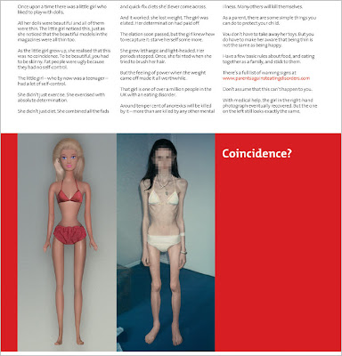
The print ads are also pretty good; a great copy presenting the illness to those that can actually help before is too late. The one below is one of the several ads that are part of the campaign:

Barbie - Coincidence?
Anorexia - Click to Enlarge

At their website, "Don't die for a diet" you can find the rest of the ads as well as good information on how this disease affects young girls and what parents can do to spot the problem on time.

Read More...

Aug 29, 2008

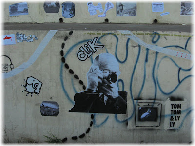
Argentine Street Art

As if it was some kind of "welcome home" party, two days after my arrival to Buenos Aires, I found out that at the "Palais de Glace" there was an exhibition dedicated to the local street art.

Named “Ficus Repens”, -known in English as the climbing or the creeping fig-, the name plays with the popular name for that plant in Argentina, where is usually called “the wall lover”.

The expo was just amazing. Huge panels were decorated by graffiti and street artists, in the same chaotic way that streets are and because most of the authors had some of their art in the city, the show included pictures of that work.

Stencil mixed with graffiti, plus comic style drawings and flyers, covered some of the panels. While at first they seemed like a huge scribble, the beauty was in the details. God was sharing space with the Devil and Dolce & Gabbana was renamed Bolche & Gabbana (Bolche is how we commonly nickname the Bolsheviks). Love, hate, sex, innocence, all the human basics were there.

These are pictures of the panels:

Comic Style I


Fashion

Grim Reaper

Graffiti

Bolche (as per "Bolsheviks) and Gabbana

Comic Style II


Then, in a picture gallery, we were able to appreciate the work of the same artists in its "natural environment", the streets of Buenos Aires:


A short biography of the artists was also available. Most of them graphic designers (or skaters), this is the complete list of participants: Abre, Bera, Bosque, Bs.As.Stncl, Cabaio, Cabe, Cam Bs As, Chu, Croki, Cucusita, Dani Dan, Dano, Dardo Malatesta, Defi, El Feder, Emm, Ever, Grothesque, Gualicho, Jaz, Kidgaucho, Mart, Mau, Nasa, Nazza Stencil, Nerf, Pmp, Poeta, Pony, Pum Pum, Rdw, Saga, Semsei, Shonis, Sonni, Suba, Sur, Teko, Torpe, Triangulo Dorado, Valentina B., Yorke.

Of course I have more pictures of the expo, so if you are into street art, just visit the whole collection at Flickr. There are almost 100 pictures there and I will probably be adding more, little by little...

Read More...

Aug 27, 2008

Limited Edition Smokes

Smoking is limited in Buenos Aires, but not as much as it is in the US. All restaurants are non-smoking but most of them are allowed to have a smoking section for their customers, and most of them do have that space. The kind of arrangement I can live with.

I noticed that some of the big brands here are competing when it comes to the design of the packs. One of those big brands is Marlboro, the other is my favorite one, Parisiennes (black tobacco, way stronger than Camel, not available in the US).

Buenos Aires haven't seen the Marlboro 72's yet, but since long ago some brands do have packs of 10, 16 and 20 cigarettes. This year I found out that Marlboro has launched a "limited edition" of the 16 pack that is pretty cool. Here some more shots of the box, that I personally like more than the traditional one...

Front


Back


Parisiennes on the other hand has abandoned (hopefully, not forever) their traditional blue, red and white colors to go out with a limited edition in black and white, with pictures of Notre Dame, L'Arc de Triomphe and the Louvre. If you haven't guessed it by now, it is a brand that has always based their communication on its "French Flavor". When I went to France though, I find out it was not a popular brand there and that they are known as "Françaises", not Parisiennes.

In this case, the public chose the images for the Limited Edition. Some time ago, they launched a website called Parisiennes L'Expertise, where different designs were shown to the public and with each pack of smokes their customers got a card to vote. These were the selected three:


I have with me a pack of 10 with the image of L'Arc, so here is a better shot of the new packaging:


As soon as I can get my hands over some of the other, I will post them here. BTW, a pack of Marlboro (20) is less than 1,50 dollars down here...the good thing is that a visit to the doctor is also a third or less than what we pay in the US, so at least there is some balance there!

Read More...

Aug 26, 2008

The Power of Inspiration

You may like him or not, but if there is something you can't deny about Barack Obama is his charisma and therefore his capacity to inspire people.

While his rival is trying to downplay that charisma as something shallow, I personally think it's his biggest asset. In a country that has been systematically divided during the last 8 years, someone that can bring people together and get people inspire to actually do something can be very powerful.

Inspiring people to do, to act on their creativity and to be an agent of change -not to just ask for it-, it is not a minor trait: you can get a lot done with just that.

The "Manifest Hope" is another good example on how his figure and his campaign boost creativity and inspiration. Their goal is to "to amplify and motivate the grass roots movement surrounding the Obama Campaign. The Manifest Hope Gallery highlights the central themes of the progressive grass-roots movement- Hope Change, Progress, Unity and Patriotism."

For that reason "Manifest Hope" with Moveon.org as a partner came up with a contest for artists, "inviting all artists to compete for a chance to present their works alongside the acclaimed and celebrated artists".

More than 1000 pieces of art were submitted and here are some of the winners and finalists.

Winner - Stars and Stripes - Phil Fung from Miami, FL
Obama Stripes

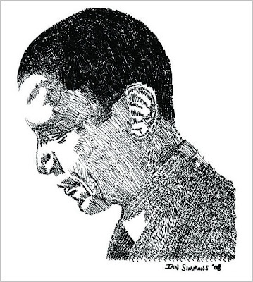
Finalist - Hussein (Handsome One)- Ian Simmons from Chicago, IL
The handsome one
Finalist - Encompass - Vincent Cordero from Lake Balboa, CA

Finalist - Earth for OBAMA - Walter Gurbo from Gilbertsville, NY

Finalist - Embrace for the White House - Ben Dutro from San Francisco, CA


The judges -which included Guggenheim Modern Art Curator Nancy Spector, multi-platinum recording artist Moby, Thurston Moore of Sonic Youth, artist Shep Fairey and many more- chose 5 winners and 21 finalists. Winners are now part of the Manifest Hope Gallery that is open to the public in Denver, CO at the Democratic National Convention, until Thursday (August 28th, 2008) between the hours of 10:00 am - 5:00 pm.

At the gallery in Denver you can also find some of the finest modern contemporary artists, acclaimed NY painters and sculptors, activated grass roots and street artists, and present the most widely recognized pieces seen throughout the 2008 presidential primary campaign, as well as newly commissioned works and previous works on loan from some of the United States top artists.

Winners and finalists of the contest are also online with a link to their its eBay page where anyone can bid to acquire one. Artists have pledged to donate the proceeds from this auction to progressive efforts aimed at helping Obama win this November.

Democrat, Republican or independant, you may want to visit the online gallery anyway and see for yourself how different artists were inspired by this challenge.

PS: The poster at the top is also one of the winners; titled "United/Change" by Shawn Hazen from Chicago, IL

Read More...

Aug 23, 2008

"La Colectiva", a City Intervened

City IntervenedFive years ago, a group of artists from Rosario (Santa Fe, Argentina) started a show that at the time they called "La Colectiva" simply because it was a collective exhibition. Since then, the gathering has been growing steadily and year after year they have more artists participating as well as more workshops, exhibitions and seminars open to the public.

During these five years, the teamwork from "La Colectiva" has generated new and different projects, one of them being "Urban Art" which consists of "intervening" the city by decorating the streets with art, mostly photographs.

The event ran from August 7 to the 17, and this year a friend of mine (Lucila Bodelon) -photographer and art professor-, was invited with some of her students to participate with their project "Territories", an itinerant exhibition that has been showed in different cities around the country. Knowing my interest for art exhibitions in general and for street art in particular, she generously sent me some pictures of the event.

The stenciled image at the top its the group signature and during those days was everywhere in Rosario.

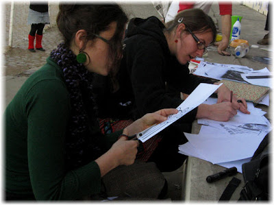
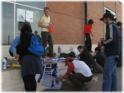
Below, you can see some pictures of the artists preparing the intervention, as well as the city streets during the event:

Artists in action

Preparing the material

Rosario intervened

Doggie appreciating art

Last but not least, a slide show of the exhibition:
(if you don't see the slides, click on the X at the top right)


If you read Spanish, you can see more about La Colectiva 08 here.
Pictures by Lucila Bodelon.

Read More...

Aug 21, 2008

Barcoding People (...meanwhile...)

I am in Buenos Aires since the 16th and I have already found enough material to blog for six months. But I still have to take pictures, download them, scan some other things, etc., so it may take me a couple of days to start posting about the creative side of this city.

Meanwhile, let's spotlight a designer's work and play "barcoding" people...

While visiting the site of a Canadian designer (Valerie Madill) I came across a drawing she made as part of a pretty common creative exercise in any school, being it the challenge of creating a symbol for someone else.

Because she found that the person she had to represent was "...a very strong, independent individual. She does not follow the norm and thinks for herself. Favourite books and publications at the time indicated strong anti-consumerism and activist views, though she came off as very polite and subtle..." she came up with this drawing that she named... "Barcode escape"


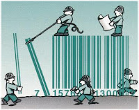
It instantly made me think of what could be an interesting design challenge, something I am calling "Barcoding people". Simply put, if you have to create a barcode to represent a friend, how would that barcode be?
It is an exremely simple and complex challenge at the same time. I tried it myself by creating two barcodes, one for my husband and the other for me.

This is the one for my husband.

It may look like nothing special, but it represents a strong side of him. As an Engineer and a developer, he has a serious love for symmetry, love that (as you may infer seeing my own barcode) is difficult for me to grasp.

Of course there is more about him than just symmetry and some type of order, but being those clear personality traits, they seemed adequate to be the main thing of his barcode. At the end of the day the symbol represents a point of view about the other...


And here is my barcode:

As you can tell I am not a very neat person, but more importantly I do not value order too much. I find some level of chaos very useful, as its capacity to "surprise" allows you to make connections that order does not. As I have said before I truly believe that chaos is underrated.

But I also like riddles and things that are not apparent to the eye. My barcode includes those things too and it is up to you to solve the puzzle that it's in there.

Last but not least, I invite you to try doing your own barcode. Try it as a game and see where your creativity takes you. If you like the result, send it to me so we can publish it here. Email the image and a short description of why that barcode represents you (or your other half or your kid or a friend). Just make sure it has only lines and numbers as most barcodes have.

For now, just take it as a challenge among friends, without any official prize. However, if we get enough barcodes I will make sure we can have some small gifts to the best ones…, nothing fancy or big, but something with a cool design from Buenos Aires.

One way or the other, you may find out that the best prize is the barcode itself. Not everybody can say that they have their own unique barcode symbol!

Read More...

Aug 15, 2008

It's Friday, Travel Somewhere!

Few things can fuel creativity in such a "fast and furious" way like a trip.

The world is big and there are so many points of view out there, that if you leave the comfort of your "known zone" and travel with an open mind, I bet money your creativity will increase accordingly.

What does it mean to travel "with an open mind"? Basically means not being the American stereotype, the one that can't understand "how these people live without air conditioning, or McDonalds, or a car, or..." (you fill in the blank).

Of course I know not ALL Americans are like that, but I have seen my own share of that. And you can say that it is unfair to adjudicate that behavior to Americans solely and you would be right: it is a pretty common human behavior, shared across nationalities. The thing is that because Americans are used to more stuff, they are the ones that show this pattern first and often.

But let's go back to travel. You don't need to go to Japan to get inspired or to be more creative. You can go to a neighborhood in your same city, one you don't know much about and set your mind as if you were traveling: look at those streets with tourist eyes, try to learn about it, discover the place, ask yourself how others live here and what tourists may say about it.

I am taking my own advice and I am traveling today. Not to fuel my creativity, just on vacations. We are headed to Argentina and Uruguay where we are planning to be with friends and family and eat a lot of meat, empanadas and alfajores among many, many other things.

Rest assured that I will be coolhunting too. Buenos Aires is a city ideal for that: crisis and creativity tend to go hand to hand and with such a long history of crisis in Argentina, creativity is in the air (for good and for bad, of course).

Meanwhile for the rest of the day, I leave you with some old ads from Telefonica Argentina that probably will make you smile. They are related to the topic because in some way they also remind us of how big the world is and how "interesting" things can be when you just mix things...

Lowest call rates to Turkey and Sweden
Sweden and Turkey

Lowest call rates to Japan and Scotland
Scotland and Japan

Also, I found this interesting list of "Creative Excursions for Team Building" in case you are interested in a trip for a team. I would like to add to that list the MoMA, either the one in NYC or the one in San Francisco.

But that's all for today..., I haven't finished packing and time is running out!

Read More...

Aug 14, 2008

Oil Saudis Against the Electric Car?

Believe it or not the politically correct stupidity has arrived to the Middle East.

According to several sources, the Gulf states are considering the idea of boycotting Nissan Motor due to an Israeli TV commercial that depicts Saudis angered by a fuel-efficient car. The commercial shows a group of Saudi oil barons leaving a hotel and encountering the new, fuel-efficient vehicle. One of them starts pounding and shouting to the car: "Hawks should peck at you day and night."


The voice over at the end says: "It's clear the oil companies won't like you."

The car, introduced on Wednesday, is set to go on the market in Japan and the United States in 2010, and globally by 2012 and was designed to provide more power than hybrid models, while having zero emissions.

But an official for the Arab Emirates voice their discomfort, accusing the ad of "igniting these [racist] instincts".

This is very similar to the whole thing between Peta and the pitbull ad. What do they want? The OPEC is not in its majority Irish or Australian. And while I imagine they could have used Cheney in the ad to imply "oil interests", I guess that would have been way more expensive and not so clear or funny. It is not an attack to anyone in particular, it is just a way of representing a joke.

But I guess the Middle East in general has lost its sense of humor a long time ago (shouldn't be considered as a great joke from God that he promised and gave them all the same piece of land as their sacred land? So many square feets of land out there but he promised to all of them the same little, tiny piece?)and the fact that the ad is israeli in origin probably made the whole thing worst.

One cannot help wondering: if they do boycott Nissan, doesn't it mean that the ad suddenly became true? What if they are using the whole "racism" thing as the excuse but the real reason behind it is the fact that the car goes against their interests? Interesting catch 22.

On a more serious note, I have to confess that I dread for the future of creative advertising. To make a point in such a short time stereotypes are necessary, as simple as that. If this trend continues, we will probably start seeing ads without people at all. In the best cases artistic ads, in the worst case just boring ones!

Via and Via

Read More...

Aug 12, 2008

Hell, Lost in Translation

Hell Money - Click to enlargeThanks to the internet and to the fact that now traveling is easier we are getting used to have fun with bad translations, mostly from Chinese or Japanese to English.

But mistranslations are older than hell and in this case I mean that almost literally.

What you see here are "Hell Bank Notes" that we bought during a trip to the Far East, if I recall correctly in Hong Kong (but I may be mistaken, don't take my word for it).

Nevertheless, the interesting thing about these bank notes is the mistranslation behind them. According to several sources -our guide during the trip being one-, even when the bills clearly state "Hell Bank Notes" the meaning has nothing to do with our idea of hell.

Apparently, the word hell was introduced to China by Christian missionaries, who trying to convert people to their faith start preaching that all non-Christian Chinese people would "go to hell" upon their death. Through a classic case of misinterpretation, the word "Hell" was understood as the proper English term for the Chinese afterlife and therefore adopted and included in these bills.

Hell Bank Note - Click to enlarge
But the misinterpretations don't end there. The Chinese belief is that when someone dies the spirit of the dead goes to the afterlife, where it lives on, doing much the same things it did in life and it is for that afterlife that they send the money.

The traditional way these bills are "sent" is by being burnt, tossed in the air during the funeral procession or left in the grave. The bills are burnt with other paper objects such as cars, houses, clothing, watches and even mobile phones, so the spirit can live comfortable in the afterlife as s/he used to live before.

Some people believe that burning those bills distracts evil spirits that would take the other goodies for themselves if given the chance: While they chase the cash, the valuable goods pass safely to the intended relative. For this reason, sometimes the "hell money" is explained to westerns as the money the dead need to be able to get some comfort... and here comes the second misinterpration. Because of the word "hell" on them some people misinterpreted the explanation thinking that it was money sent to "bribe" the devil, in case you were going to hell.

What this has anything to do with creativity and innovation? A lot. Words really mean very little without an "environment" or a background that gives them the final meaning. They make sense not so much by themselves but in relation to other words, a historic and even geographical context, and as people do, they can change, evolve or simply mutate. Take them out of context and "new" things can happen; that is also how new ideas are born...

If you are interested in other mistranslations or how some other words have evolved to have a slighlty different meaning, check my postings about slogans or the ones about other words lost in translation.

Read More...

Aug 11, 2008

If you don't want to read this blog... Press 1

- If you are here by mistake, press 2.
- If you don't really like to read, please press 3.
- If you want to contact me, press 4.
- If you don't want to contact me, press 5.
- If you are experiencing technical problems to read UglyDoggy in your browser, press 6.
- For any other option press 7.


"Thanks for your selection. Please wait until we can connect you with our blog technical support team. While you are on hold, let us remind you that UglyDoggy is the best blog out there. Want to have fun? Visit UglyDoggy. For useful tips about creativity, marketing and communications, make sure you visit UglyDoggy daily. If you like to read, you will enjoy UglyDoggy..." (repeat until exhaustion or until you start screaming and sobbing)

Sigh, you get the idea. This posting is half a rant, half a reminder for marketing departments that using common sense when communicating with your customers should always be a must. This usage of common sense includes your recorded answering system. Let's face it, it is almost always the very first thing your customers are greeted with when they call your company's customer service line. But people are calling for VERY different reasons..., so why you think it may be a good idea to have the same promotion for everybody?

If you don't like to read or your never really wanted to be here, I shouldn't be telling you that if you like to read you should visit UglyDoggy daily. You already told me that you don't like to read so the promotion can be perceived like a) I don't listen to your answers or b) I am mocking you.

But let's go with a real example, one I suffered from Comcast during the whole weekend. My internet connection went down on Friday. I called, went through a whole cascade of press 1,2,3 that was basically like saying -> yes, I am an actual customer -> the service I am calling about is internet -> I am having problems with my connection.

Now, "having problems with your connection" means nine times over ten, that you are not being able to connect. So do you think is a good idea to have me hearing -once and again, again, again-, that Comcast has one of the most reliable services for internet connection and that I can have the fastest connection through Comcast? Or that I can also contact customer support via email? I am not being able to connect, people! That means that I don't care how fast the connection is, because I can't, let me repeat that, can't connect. And, if I can't connect, I really don't care if I can reach customer service via email. Guess why? Because I can't connect, what means that I can't send or receive emails. Capisce?

Now, if you really want to make things worse, make sure you have me on hold hearing those same promotions for more than one hour.

I have nothing against automatic answering systems, I do understand the need for them. But use them wisely, making sure that you are not infuriating your customer or your prospect. You are using the cascade system to be able to redirect your callers to the right department, right? Well, you can also redirect them to the right promotion, avoiding fueling a fire that may be already bad enough.

It is mind boggling how much time, effort and money companies put on their traditional advertising (TV, prints, ads) but how little attention they put to other means of communication that they are using to communicate directly with customers and prospects.

I have to say that Comcast is not the only provider that is not using common sense when promoting their services in their answering system. But here comes the rant: so far it has been the only provider that got me on hold for more than 4 hours (5 calls=4 hours on hold) without being able to talk with a human being but hearing during all that time how fast my connection could be! I am not surprised it has been voted the second worst company in America.

If you are wondering, I am still without internet connection and blogging from a Starbucks. Of course I already wrote an email to their SVP of Operations and so far I received a very polite answer with an apology about the time I spent on hold, but no connection so far, no technician visiting my house, nothing.

PS: If you have experienced something similar with an automatic answering service press 7 or better still, leave a comment.

Read More...

Aug 8, 2008

It's Olympic Friday, See How the World Comes Together

Today a big part of the world will be focusing in the Olympic Games, that were originally conceived as a way to bring nations closer and to have the youth of the world compete in sports, rather than fight in war. Sadly, so far it doesn't seem like those goals were ever achieved.

But just the fact that there was an intention to bring nations together, remind me of a much modern event (that in fact took place for the first time this year) and that is also trying to get the world united: I am talking about Pangea Day.

So, to celebrate those good intentions, I want to share with you some videos made for this event, that are not really "new" but that haven't circulated as much as they should. How many times have you seen French people singing the American anthem with passion or Americans singing the Mexican? Or a British choir defying the weather to sing the Argentinian anthem?

France sings USA


There is something very moving and special about these videos. I am not sure if it is just the fact that are mixing countries that without being enemies have a history of friction among them or if it is that you can feel that they are singing with respect and passion even if it is not their anthem nor their language...

UK sings Argentina


Usa sings Mexico


Pangea (the name comes of course from the supercontinent that once we were) can become the Olympics of the future, considering its mission: "In a world where people are often divided by borders, difference, and conflict, it's easy to lose sight of what we all have in common."

What makes it more interesting is the fact that we can all participate. There will be more Pangea Days in the future and you don't need to be the best at what you do to be part of it. You only need to share the vision or be open enough to want to learn and know about other cultures. At the end of the day, as one of their spokepersons said, it is not that the films can change the world "...but the people who watch them can. By changing minds, we change the world."

If you want to learn more about upcoming Pangea events, sign up for their mailing list. And if you feel moved by any of these anthems, make sure you pass them along.

Read More...

Aug 7, 2008

Creativity & Logic

This ad was in a Creativity Mag; I don't remember who the agency was because it was long time ago but the moment I saw it, I cut it out to join my collection of "sayings" that adorned my office. It was been pinned to the wall at my office for a long time (you can still see the little hole from the pin at the top of the page).

Creativity and Logic
It may not be the prettiest design but it is more than just an ad for me. It's something I believe in.

Read More...

Aug 6, 2008

Wear Your Favorite Movie!

What you see here are called "cinematique frames" and their uniqueness resides in the fact that it incorporates the images from your favorite film on a pair of trendy eyeglasses made by designer Zakarias Tipton.

The frames are made by recycling 35mm and 16mm movies. The film is collected from cinemas and dates from after 1989 (the fall of Communism in Hungary).

The 29-year-old optician first began experimenting with vinyl and plastic glass frames about eight years ago and now sells a range of Cinematique eyewear with clips from the silver screen worked into the frame.

I have to say, they look beautiful and really different...


A couple of close up shots:


So far, he works with a list of about 300 films to choose from, but as he explains, "Not all films make good material though, as the images must have bold colors and lots of contrast."

"They (customers) tell us they'd like a film from Woody Allen or they want 'Mission Impossible 3' in their frame or they want a picture of some famous actor, then we will make it here and ship it to them," Tipton said. According to him a favorite among his clients "is the 2003 action movie 'Once Upon a Time in Mexico'..., there are explosions everywhere, contrast, people flying, jumping, which brings out an added dimension."

Some frame fronts also include very small pieces of 16 mm film laminated between layers of cellulose acetate, as you can see here:


According to an article in Reuters, the company is based in Budapest but the collection is sold across Europe and North America. Sadly, I couldn't find where exactly you can get them in the US.

At his website you can see his actual collection, and if you can get your hands on one of these, please let me know. I do not wear reading glasses but I would love to have a pair of sunglasses with a scene from the "Godfather" or from "La Mala Educacion"!

Via

Read More...