Apr 30, 2008

To Be or Not To Be (Subtle) - Part I

I am one for subtlety when possible. Let me re-phrase this, I am one of the most direct persons in the world but still I am a believer in the power of subtlety -again, if possible- when it comes to creativity.

But as with almost anything, there are occasions when you want your message to be as direct as possible, sometimes for its shocking value, sometimes to get to a wider audience.

When it comes to art, advertising or design, that is normally the case: the less subtle the more shocking and more "easy to understand" but, at the same time, because subtlety is lost something else is lost. Sometimes is the desirable "wink" from the issuer to the receptor, sometimes is its usability.

Let's see an example, in this case using some "geek jewelry"; to be more specific, "geeky wedding bands". Let's see first one with some subtlety:


This is a geeky wedding band, no doubt. It obviously says "we are geeks" (and proud of that, as they should be) ;) but also is subtle and therefore very usable. What it says? It has the initials of the bride in binary code, there is a wink to the alike.


Now, lets see an interest "object" conceived also as a geeky wedding ring, but that has no subtlety at all...

Here it is:


It gets your attention, no doubt. From a jeweler point of view is well done and a "good idea" in the sense that the artist shows her ability to mix materials. But is not subtle -not at all-, and my guess is that while it may be a great way for the author to show her skills, there will be less people brave enough to actually use these as their wedding bands. In fact, I personally would call the first set "geeky" but if in use, I would call these second set "nerdy".

Basically, the lack of subtlety give them more shocking value -you will remember these more- but makes them less usable. It doesn't make one "better" than the other, don't get me wrong. It just make one more "designed" (and easier to use) and the other one more "art" but less "practical".

Subtle ring as seen in Jakob Homan.com , not so subtle as seen in Oddee.com, more from the same artist in Flickr

Read More...

Look Twice

This is a very ingenous advertising campaign from South Africa. These posters are placed on the walls of bathrooms in pubs and clubs. They look like old Russian propaganda posters, and at first sight they seem write in Cyrillic... But what makes the ad so ingenious is the fact that is a mix of message, brand and "location".


If you are still wondering what is the message on it, take a second look (or click to enlarge). This ad is located facing the mirrors on the bathroom, so when you are washing your hands... you can easily read the message.


It seems to me like a great idea, specially considering that the brand behind this campaign is "Russian Bear" Vodka. So they keep the "Russian spirit" but they get your attention, probably twice, over a message that seems to be necessary to repeat over and over again.


Source: my friend Advert-Eyes, a great website focused on print advertising!

Read More...

Apr 28, 2008

When Nature Looks Fake

Going through all our pictures from San Francisco (my other half mutate to a Japanese when we were there and we have more than 600 pics!) I came across this one. I am not really sure if I like it or not (is a bit 'sappy' for my taste), but what struck me is the fact that at first sight I thought "It looks as if it was photshopped".

I was there, so I know it is a real picture as I know it took him like 10 takes and some yelling to get the birds flying and get it "right". Still it looks a bit unreal, like a not very well done photoshop work.


What makes me think about how difficult it has become to distinguish "fake" from "real". By the same token, digital cameras are making it easier to shoot, shoot, shoot, until something good comes out... so, it makes you wonder, how would artistic photography continue to evolve? How would photographers be measured in the future? How their technique will be appreciated?

I mean, it is just a matter of evolution. I don't think that digital photography and/or how easy it is now to manipulate images is a bad thing, not at all. I am just wondering what we will consider, 30 years from now, a great photography... would it be more on the side of "abstract" objects? Would pure creativity take over technicality? Would these changes split photography into new 'sub-genres'?

What do you think?

Read More...

Apr 26, 2008

Flintstones Shakers

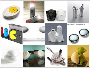
And yet another Salt and Pepper shaker for my collection. They just look like rocks, therefore the nickname of the "Flintstones Shakers".

(You can buy them @ the MoMA in San Francisco)

If you still haven't seen my collection, here is a preview:
(click to visit)

Do you have a S&P shaker that you believe it should be added to this collection?
Let me know!

Read More...

Apr 25, 2008

The Pancho Villa Ad

I have to share this one just because it made me laugh. While in San Francisco, we went to a small restaurant half Mexican, half Dominican, in the Mission neighborhood (that is mostly Mexican).

While having lunch I noticed what seems to be a very old poster framed, hanging above a door, with a Pancho Villa claiming "I want you, Gringo". After lunch I decided to take a closer look and I find it pretty funny. So I decided to take a picture of it and here it is:


What made everything even funnier was that while I was taking the pictures a very old Spanish speaking lady approached me and asked "Who is that guy?".
When I answered "Pancho Villa, I guess" she started shaking her head and repeating in loud voice "Oh my God, Pancho Villa, mira, Pancho Villa, es Pancho Villa". She seemed totally impressed by that.

The waiter at the restaurant didn't know enough about the poster. And while it seems "fake" to me, while looking online to see if I could find more info about it, I found some t-shirts with the same image that according to the company selling them are based on "vintage posters" from the Mexican Revolution. (the T-Shirts do not have the whole thing, just the image and the "I want you, Gringo")

Is difficult to believe that this "ad" was made a couple of years before Uncle Sam started his famous "I want you" campaign for the US Army, but I guess anything is possible. My knowledge about the Mexican revolution is pretty superficial, but I do know that they wanted the US to intervene -so again-, something like this may have been part of their propaganda. If that was the case, I guess that whoever came up with the Uncle Sam poster was "inspired" by this poster. Or maybe it was a fairly ordinary pattern, the same way that the "Wanted: Dead or Alive" was at some point.

The whole thing reads (sic):

I WANT YOU
GRINGO!
fight in the
MEXICAN REVOLUTION
and be proud to ride with
PANCHO VILLA
Nearest recruiting station
Juarez, Mexico
Dynamiters - Machinegunners
Viva - January 1915 - Viva


Totally faked or based in something real, it is impossible not to smile at the naivete of the message, as well as the "open positions" or the bonus offered in the form of pride.

If anyone out there knows more about the poster, please let us know!

Read More...

Celebrating Earth Day

A nice commercial from Belgium against littering.

I surely hope "Mother Earth" could do this for real; at the same time I have the feeling that this is exactly what she does with earthquakes, tsunamis and climate changing... getting rid of those little things called humans that are giving her a hard time!


As a fan of flipper games, I find it pretty well done: it does replicate one of those games with accuracy.

I don't know the name of the ad agency responsible for the ad, if someone knows it, please let me know or leave the info in the comments area. Thanks!

Read More...

Apr 19, 2008

Breedism, Racism?

New interesting commercial from Peta.org, pointing out the racism involved in considering mixed breed "inferior" ones.


Learn more about PETA's ABC campaign at PETA.org.


Creative: Dan Neri and Scott Murray of Matter
Director: Steven Tsuchida of Oil Factory

While it may sound exaggerated in reality, pure breeds fanatics would go to any extreme to maintain "pure bloodlines" even when sometimes that quest plays against the dogs. And I know that very first hand because I am the proud owner of two "pure mutts" that have way less problems than the "pure breed" bulldog I had when I was a child!

Thanks Mesia for sending the link!

Read More...

Apr 16, 2008

Breaking the Ice

This is a (more or less) funny commercial from my country (Argentina) for the Pepsi brand. It is a bit over the top, some may not like it at all but it plays over the differences between generations, that is something always handy to resort to, when brainstorming ideas.

In this case, the ad works around how much the 'rules' have changed when it comes to an introduction between two men. In Argentina, our fathers and grandfathers used to shake hands. When it comes to my generation and the younger ones, even guys kiss each other in the cheek (just once) when they meet.

Of course these differences may end up causing some awkards moments when the two generations meet -as it is in this case-, when the girl introduces her very young boyfriend to her pretty old fashioned father.

The slogan at the end reads: "To break the ice, dare for more"


I think the ad could have been even funnier, but if we consider that during a good number of years the Pepsi brand was all about "the new generation" it makes sense that they moved to something like this now that their slogan is "Dare for more".

When you think about how much the habits have changed in the last 20 or 30 years, you will probably notice how many other ads could play over the gap between generations!

Read More...

Apr 15, 2008

Sex and Sensibility

Sunday we visited the Cartoon Art Museum here in San Francisco. One of the exhibits, "Sex and Sensibility" showcases the work of ten female cartoonists on the humorous aspects of sex and love. It features cartoons from Liza Donnelly's book under the same name published by Twelve Books.

Some of the cartoonists are Carolita Johnson, Victoria Roberts, Barbara Smaller and Signe Wilkinson.

But that wasn't all. Another area explores the history of cartoon art including works from the most renowned and creative cartoonists of the last century. This exhibit traces the evolution of cartooning through its many forms including animation, comic strips, comic books, editorial cartoons, magazine cartoons, and underground cartoons.

Here, an American classic that became famous worldwide:


I bet this lunch box makes some people feel quite nostalgic!

Read More...

Apr 14, 2008

SF - I'm Loving It!

We arrived to SF last Saturday after a long, long trip. Not so long in hours but we really didn't sleep too much the night before (the flight was at 6 am) so it felt like a never ending trip.

Delta didn't help too much (that will be a whole posting by itself) but the torture of the flight was quickly forgot after a great weekend in the city. We had an unusual couple of days of warm weather and we visited the MOMA, the Comic's Museum and Fisherman's Wharf.

Of course I am loving it! Good design is everywhere and hills and all, we are in a real city where public transportation is common and there are real streets to walk (remember I am living in FL!).

We were both impressed by the SFMoMA and we couldn't stop taking pictures of the building. Here you can see a couple, one from the series I am calling the "the MOMA moon" and the other one playing hide and seek in the museum's open roof.

The Moma Moon

@ the MOMA Roof

In one weekend we have taken almost 300 pics and most of them are inside the MoMA. As soon as I have my Flickr organized, I will share. But is time to go out and discover more of this (now a bit chilly) gorgeous city.

Want it or not, I'll keep you posted!

Read More...

Apr 11, 2008

It's Friday -Relax

I believe we should all take lessons from our furry friends. Truth is that the few times I have seen cats or dogs "stressed" they are in that state because of their "human environment"..., normally they know how to live without worrying too much!

"Yoga cat" - as seen at my favorite
non profit,
"Best Friends"


Enjoy your weekend! And stay tuned that next week I will be blogging from San Francisco about Ad:Tech and everything else!

Read More...

Apr 10, 2008

A Blind Call

From Europe, a funny way to get people to do some good. I like the fact that is not just about helping the blind people, but that also plays in some way with the fact that the one receiving the call is "blind" too -he really doesn't know what's going on...


Good ad for a good idea. The cost of the call is donated to the "League of the Blind"... and for real, if you are going to spend money anyway because of the mistaken call, is better to give it to a non-profit that to your cell phone provider, that let's face it, they are not exactly in need of some more cents!

Read More...

Apr 8, 2008

More Business Cards Worth a Look!

No, I am not obsessed with business cards, and yes, I have already posted a good number of them, here and there. But I truly believe that creativity applied to business cards is worth noticing; it is a form of advertising too.

Is a "first impression" tactic and even when it really doesn't mean that the owner is the best professional in their industry it helps when the cards is easy to remember or even better, easy to spot among the other 3 trillion cards that we all have stacked somewhere.

So, here are more examples of business cards with some extra value added:


The Passionate Art Director
(So passionate, that has bloody business cards)


The edgy graphic designer
(I hope his work is as good as his card and we do not need
to use his business card to cut our veins after seeing his work)


Last but not least, a very special one. You don't see very often creative lawyer's business cards, but this one seems to be the exception...

The Divorce Lawyer
(very graphic indeed!)


Of course, not everyone can afford these business cards. And in my humble opinion if you can't make them extremely relevant, go with traditional ones.

And no, I am not done with business cards, by the way. I am in the process of interviewing another designer that has a whole project based on business cards. Stay tuned!

Found at Creative Bits

Read More...

Absolut Controversy in a Gobal World

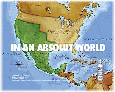
Is not news by now that the new ad from Absolut Vodka for the Mexican market, may become a major headache for the brand in the US. It got a lot of attention -what normally is desirable-, but if it leads to a boycott from American consumers against the brand, all that attention becomes a hit against the ultimate goal of any product, that is to sell.

Nevertheless, I have to wonder how much this was a bad decision or a very deliberate one. If it was a bad decision, they just forgot how global the world is now and how quickly information travels from one point in the world to the opposite one (and is not even the case!).

If it was a risky and deliberate decision, as I see it, it may have considered the general anti-american sentiment out there that (that let's face it, includes most of Europe too) and risk the possibility of an American boycott, believing that such boycott may lead to more consumption of the brand by the rest of the world. A very dangerous strategy but a strategy in the end.

BTW, in case you haven't seen it yet, here is the ad:

Agency: Teran/TBWA (the map shows the border of Mexico and the US
where it stood before the Mexican-American War of 1848)


CNN calls it "Absolut Disaster" and if it was any other brand I would agree. I am not sure it will harm so much THIS brand in particular, considering its advertising history, positioning and their target.

Now, the fact that that company has already apologized and promised to not run the ad anymore, make me think that was just plain stupidity and not a bold move. What do you think?

PS: The reason I think it is plain stupidity is not because I don't like the ad (I do like risky moves when appropiate), is because they didn't seem prepared in the public relations' front to give a good answer knowing that the ad would generate some controversy!

Read More...

Apr 7, 2008

Chaos Is Underrated

Today I came across this sign @ Stein Mart and I had to take a picture of it. Such statement makes me feel good, of course, -whoever knows me knows that the my middle initial 'C.' is not really for Cecilia but for Chaotic- but I just love the spin on the matter.

Me, I have always defended and I will always defend my 'organized chaos'. At least in my case I don't have to spend too much time looking for something: 99% of the time I know exactly in what pile of papers I may find my salami.... :) Seriously, all my desks may look as a mess, but I always know where I can find the paper I need.

MY spin on the issue is that creativity needs chaos... even the Bible says that 'at first it was chaos... and then God created heavens and earth', what clearly supports my theory that chaos is useful for creation. Ok, I am not religious at ALL, but this part of the Genesis was too convenient to let it go...!

Read More...

Apr 6, 2008

Futurology...

...is -no doubt- a very risky "science". History has proved that our imagination and our power to do and discover and create do not go together as well as we would like them to go!

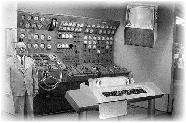
If you don't think so, just check out this article from a 1954's Popular Mechanic Magazine (with the "original" photo):

"Scientists from the RAND Corporation have created this model to illustrate how a “home computer” could look like in the year 2004. However the needed technology will not be economically feasible for the average home.


Also the scientists readily admit that the computer will require not yet invited technology to actually work, but 50 years from now scientific progress is expected to solve these problems. With teletype interface and the Fortran language, the computer will be easy to use."

I wonder how surprised those guys would be by a MacBook Air!


PS: Even when I did my own research to find out more about the picture, it appear as legitimate when I published it. Thanks to one of our readers, I just found out that it is not... so, the orignal photo wasn't so "original".

But the statement about Futurology stands. For example, Charles Darwin, in the foreword to his book, The Origin of Species, 1869, said: «I see no good reasons why the views given in this volume should shock the religious sensibilities of anyone». Check out some more interesting future predictions gone bad!

Read More...

Apr 5, 2008

Three Design Contests...

...that you may want to know about! A bit for everyone, from designers to architects, they all seem interesting challenges.

1. The 2009 Michelin Challenge Design
Michelin is looking for vehicle design concepts that can become America's Next Iconic Vehicle. They see it as a combination of "BRAVE & BOLD; Unique; Emotional; Courageous: Michelin invites you to design America's next iconic vehicle! Uniqueness emotional appeal, design courage and technical execution are elements that will be evaluated by a distinguished panel of experts from the industry" Read more here.


2. Workstation of the Future - 2008 Challenge
You are invited to investigate the future design of the work environment – this is your opportunity to showcase your creativity to the Australian design community! Now in its second year, Workstation of the Future 2008 is recognised as one of the most exciting design competitions in the country.

Iken in conjunction with various sponsors is offering a unique and exciting opportunity for architects, designers and students to conceive the office of tomorrow. There are great prizes to be won including a D10-day trip to Orgatec, Cologne, a visit to our manufacturer Gispen in The Netherlands and a visit to Okamura in Japan! Read the bases here

Last but not least...

3. ZEHNDER AMERICA -2008 DESIGN CHALLENGE
The contest is open to the following industry professionals: Kitchen & Bath Designers; Architects; Interior Designers and Custom Builders who would like to showcase their talents and ideas through their entry of a completed bathroom, master bathroom, powder room, spa or mudroom. Entries in the competition must show the use of a Zehnder towel radiator in the project. This is not a concept design contest and an actual completed room is required to participate. Read more here (will open in .pdf)

Go ahead, get into one or spread the word!

Read More...

Apr 4, 2008

A Generation Symbol

A friend sent me this Canadian cartoon. I guess that what makes it so funny is the fact that is so true.

It very clearly "explains" why the ones born between 1980 and 1994 are called the "Generation Y".


I truly hate this "fashion trend" but then again, when I was a teenager the "baggies" (big, BIG, BIG, baggies) were the fashion that you had to wear. I am not sure what is worst, really.

Funny fact: Lots of kids wearing these oversized pants also like to play as if they were the "dangerous" type. Give me a break, you can't rob me and try to run wearing THOSE...

Thanks Brig for the cartoon!

Read More...

Apr 3, 2008

A Chilean Che?

Yes, I know, the Che Guevara is a "Latin American persona" no doubt. Better said he is a worldwide recognized icon, for good or bad. A symbol for 'revolution' and the icon for "rebel".

But I still think that there are few countries that can really claim him as "one of them". One is where he was born, Argentina. The other one is where he fight the most, Cuba. And in some way, the last one could be where he was killed Bolivia. Considering that both Argentina and Bolivia have some history of "problems" with Chile -mostly because of borders issues- it is a bit weird to see a 'Chilean' Che even if it is a made up one for a Greenpeace ad (of course it is weird mostly for me, because I am from Argentina!).

Is true that the Che visited Chile during his young years and BTW if you haven't seen "The Motorcycle Diaries" yet, make sure you put that one on the list!

Here the ad:

Anyway, this is ad was part of a 2007 campaign from Leo Burnett Chile for their client Greenpeace. The copy reads: "Anyone who becomes a member, is already imagining a better world. Join the fight."

The other ad from the same campaign portrays a teenager Lennon...


Now, those were two very different "fighters"... don't you think?

Found via -> YouTube--->FotoLog

Read More...

Sitting on the Money with Jar Lights

In Argentina I used to do metal smithing as a hobby. From my group at the workshop I used to be always the one that would come with the smallest things (except the time I made for myself a huge bracelet, but that's another story).

I think it was related to my patience, or better said, my lack of. I do love huge things made of metal, but I just don't have the patience that it takes to get those things done. Still I am fascinated by big metalwork pieces that are done by attaching (welding) small pieces together.

That is exactly what Johny Swing does. His projects are huge, and they have the plus that some of them are also recycling objects. Take a look:

The Loose Change Chair
( as the name suggests, made of loose change)


The -Oh So Lovely!- Big Jardalear Lamp
(yeap, each one of those are storage jars)


Made with 7 mid sized satellite dishes and 48 storage jars as lamp covers. And last but not least, the impressive...

Nickel Sofa
(7000 nickels and 35,000 welds later...)


At his site you can see a bit more of his work. Not too many pieces, but again, with projects so large, I am pretty sure each one needs months to get done.

A funny fact though is that the chair and the sofa may be 'illegal' products. Suppousedly is against the law to tamper with the US currency!

Read More...

Apr 2, 2008

Friends Will be Friends

Remember that song from Queen?

"When youre in need of love
they give you care and attention
Friends will be friends
When you are through with life
and all hope is lost
Hold out your hands cos'
friends will be friends right till the End"


It seems to me that this Argentinian commercial is a bit based in that type of friendship. A tight one that is pretty common in my country.

You don't need to understand Spanish at all to understand the concept and with almost no dialogue, all you need to know that the very first line is a friend saying "And this is our present to you" and that at the end the closing says "there are moments that are just our moments".


I believe that you can tell a lot about a country by its commercials. I just realized that you can tell from mine not only that psychoanalysis is pretty common in Argentina, but that great, deep, longlasting friendships are also the norm. Enjoy this commercial (and I promise that I will translate some other good ones to post them here!).

BTW, the ad is for a beer (Norte)... and I can't help but wonder why would you give a present like that one to one of your best friends under those circumstances? Maybe you just don't want him to get married?
Thanks Brig for the ad!

Read More...

Apr 1, 2008

Almodovar is Back...

...With "Los Abrazos Rotos" (The Broken Hugs), his next movie.

His blog has some material about the movie but the best part of the blog is where he talks about his "COMPROMISOS SOCIALES" (Social Commitments) and shares with us the story about how the Principality of Monaco cntacted him with "...an unprecedented project: they had thought that the theme (aesthetic and cultural, the leitmotif that would provide the ornamental and musical content) for the traditional “Rose Ball” -their well known charity ball- would be the “Movida Madrileña”. As Supposed Emperor of that Movida, they were asking for my opinion about it and if I could collaborate minimally in preparing the event. My first reaction was a feeling of absurdity and the second was that I found the idea enormously flattering. "

So he decided to take matters into his own hands, and among other things, he made the invitation (see below).


But the whole narration in his own words of how he prepared for this picture and event is something you can't miss. So here is the link to it in Spanish (if you can read Spanish go with this one) and here you can read the same story in English. Just look for the "Social Commitments" and "Image Problems" titles, and enjoy it!

Read More...