Jul 31, 2008

The Very First TV Ad in History

Everyone seems to agree that the very first TV commercial in history was one for the Bulova watches.

According to their site, "Continuing its tradition of advertising firsts, Bulova airs the first television commercial: a simple picture of a clock and a map of the United States, with a voice-over proclaiming, 'America runs on Bulova time.' The 20-second spot costs $9...".

The commercial was aired on July 1, 1941, at exactly 2:29 in the afternoon, when the New York City NBC affiliate, WNBT, aired a 20-second spot before the start of the Brooklyn Dodgers-Philadelphia Phillies telecast.

Now, the one million dollar question: What do the State of Alaska, Penicilin, Snow White & the Seven Dwarfs AND the first TV commercial have in common...?

(Warning: this is a bit mean. I know it is mean but I don't care. It is just too funny.)

According to this site, what Alaska, the first TV commercial, Penicilin and a long list of other things have in common is...

(drum rolls, please)

...that thay are all younger than McCain!


I told you this was a bit mean, in fact even my mother may not like this posting (specially because she is not younger than McCain). But I bet that she being just a couple of years older will be the first to tell you that running a country is probably a tiring work and that she would leave that task to someone younger.

I don't vote and just so you know my problems with McCain are way deeper than age, but I guess that my feeling that he could share the neighborhood with the dinosaurs wasn't so mistaken after all. My feeling was related to how he thinks, not how old he is but now I'm thinking..., you know,...penicilin, can you believe it?!

If you want to see all the things that the site has listed so far or you want to throw one or two more to the list, here is the link.

Read More...

Build Your Own Font

Very nifty idea from FontShop. Useful for designers and I guess even more so for wannabes, FontStruct is an online do-it-yourself font-building tool.

Free and pretty easy to use, it allows a great variety of combinations. Of course -as they are the first to say-, not all fonts/styles can be achieved this way; but it is a great tool to make by yourself a completely different font or a base for a font that later can be retouched with other tools. To get a better idea on how it works, check the demo below...


Working one letter at a time, users can add and remove shapes including stars, blocks and dots to achieve the look they want. Once they're done, FontStruct generates high-quality TrueType fonts, ready to use in any Mac or Windows application.

Users can then decide to keep their "FontStructions" private, or they can share them with the FontStruct community for discussion, rating and downloading.

So now thanks to FontStruct all the options are online too: free fonts, paid ones and DIY.

Via

Read More...

Jul 30, 2008

My Kind of Table

Periodic TableI found this via NotCot and I fall in love instantly. I can't care less if some call it a "nerdy" object.

It is a periodic table converted into... a real coffee table! But what I find absolutely charming is the fact that it has samples of each element, embedded in solid acrylic blocks.

According to the company offering the table, "By embedding all element samples in clear acrylic, they are beautifully presented and also protected from tarnishing. This format also helps to addresses health and safety issues, as all potentially toxic or corrosive substances are permanently encased in a thick layer of robust resin. Argon gas and mineral oil is further used to ampoule reactive samples and preserve their freshly cut appearance."

Of course is not cheap (£4,750 what means around U$ 9000). But come on, you have a samples IN your coffee table... how many people can say that? And from the practical point of view, if you ever decide to kill someone you have a couple of poisonous things right there, at hand.

Periodic Table

Last but not least, once the acrylic blocks are arranged in the right order, the grid is carefully illuminated and beautifully presented beneath a sheet of toughened glass while the table itself is created by British Craftsmen using burred oak. And individual acrylic blocks are available for sale (I guess as a replacement if needed), although as they explain "...some elements are costly to send internationally."

It just made my wish list. I still can't see anything nerdy about this object but I guess that's me.

Link

Read More...

Jul 29, 2008

"Sexist" Ads for a Chuckle

None of these ads are new but I saved them a long time ago just because they made me smile. I know some people may find them "sexist" but again, I am not politically correct nor I think that ads that are obviously just making a joke should be analyzed any deeper than that.

First, a classic from Brazil, for the 31 years of Playboy:

Playboy Brazil

Second, a PostIt ad that for a long time I thought it was a spoof but my good friend from AdvertEyes was able to find the agency and verify it is for real.

Don't start to cry out loud, ladies, it could have been the other way around too....

Post It ad

Last but not least, the one I like the most. It is really borderline -can go one way or the other- but considering the shop is in Milano, I think it just shows a very Italian way of looking at things...

Hairdresser Ad

It may seem a little too much but I think that at the end, the carefully way it was designed makes it very palatable!

Read More...

Jul 28, 2008

The World is Flat..., and Free!

If you haven't read "The World is Flat" yet, here is your opportunity to get it for free.

Until August 4th, Farrar, Straus and Giroux and Macmillan Audio will be offering the audio edition of Thomas Friedman's book for free. Listeners will receive the audiobook in three easy-to-download sections.

If you read it already, you may want to sign for this promotion anyway, because the added bonus includes an exclusive prepublication audio excerpt of Friedman's new book:
"Hot, Flat, and Crowded: Why We Need a Green Revolution and How It Can Renew America".

This new book will not be released until September 8th but by joining the publishers' mailing list you can get the audio excerpt.

I got the offer via email (from a trusted source, "Change This") and I have already signed up and downloaded the first two sections. Easy as a breeze.

To sign up, visit the publishers' site.

Read More...

Jul 27, 2008

Tommy Lee Goes Green

The new campaign from Planet Green, "the first all green TV network" has its ups and downs. Some of their ads are borderline with disgusting -like the one with the guy in the beach with a solar powered swimsuit- and some others are good, just not extremely creative, like the one with the "green" inmates.

But the ad with Tommy Lee and Ludacris "competing" to prove who is more eco-friendly is a small gem. Take a look:


Who would have thought that Tommy Lee could be SO green, uhm?

PS: If you want to see the rest of the campaing (again, these ads are not as good as the previous one) so far the other ads are: Prison, Beach and Bank.

Read More...

Jul 26, 2008

When the World is the Canvas

The saying "art mimics life" generally holds true, but what you will see in this case is exactly the opposite: This is life that looks like art.

All the images here are not gorgeous abstract paintings or patterns on a tapestry but satellite images, part of the NASA collection.

The collection so far includes more than one hundred thousand images and while it is pretty well organized (by country, type of satellite, US State and others) it is almost impossible to go through it in just a couple of hours (or days!).

Some images are thermal, some are animations based on the information received and some look like pictures from a lomo camera. I picked the ones that struck me more representative of some kind of art. I think that all of them nicely framed and hang from a wall, can pass for art.

Make sure you click to enlarge the pictures to be able to see them in detail and let's start with the clouds...

The Aleutian Clouds
Aleutian Clouds
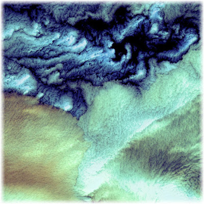
According to NASA, what looks like a painting with strokes of Monet and Renoir, is in fact the image of cloud formations that were seen over the western Aleutian Islands. Their color variations are probably due to differences in temperature and in the size of water droplets that make up the clouds.


Acrylic India

What could perfectly be an acrylic painting is in fact an image of the Kachchh region in western India that suffered the most deadly earthquake in India’s history. This shaded topography view of landforms northeast of the city of Bhuj depicts geologic structures that are of interest in the study the tectonic processes that may have led to that earthquake. However, preliminary field studies indicate that these structures are composed of Mesozoic rocks that are overlain by younger rocks showing little deformation. Thus these structures may be old, not actively growing, and not directly related to the recent earthquake.

In this image, colors range from green at the lowest elevations, through yellow and red, to purple at the highest elevations.


Sheep Skin Vortices

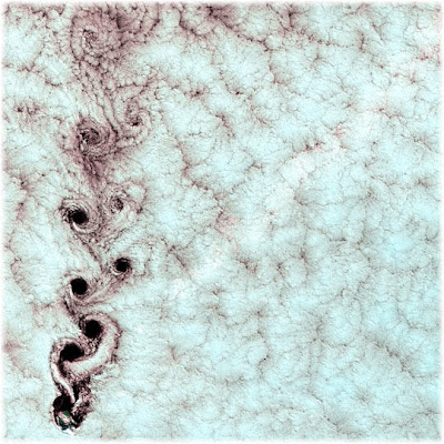
Each of these swirling clouds is the result of a meteorological phenomenon known as a von Karman vortex. These vortices appeared over Alexander Selkirk Island in the southern Pacific Ocean. Rising precipitously from the surrounding waters, the island’s highest point is nearly a mile (1.6 km) above sea level. As wind-driven clouds encounter this obstacle, they flow around it to form large, spinning eddies. The remind me of sheep skin or of something worked out in cotton.


Carnivorous Mauna Loa

In this case the image has something of a flower, and probably because of its shape it reminds me of a tropical carnivorous plant. But this is the thermal infrared false color image of Mauna Loa volcano, Hawaii, that shows lava flows in different colors from each other, due to their relative ages.


San Francisco, Lomo Style

These images of the San Francisco Bay region are from 2000 and each one covers an area 60 kilometers (37 miles) wide and 75 kilometers (47 miles) long. The almost seem like a picture taken with a lomo camera but according to NASA, this is how it goes:

- In the upper left, the color infrared composite uses bands in the visible and reflected infrared. Vegetation is red, urban areas are gray; sediment in the bays shows up as lighter shades of blue. Thanks to the 15 meter (50-foot) spatial resolution, shadows of the towers along the Bay Bridge can be seen.

-In the upper right, a composite of bands in the short wave infrared displays differences in soils and rocks in the mountainous areas.

- In the lower left, the composite of multispectral thermal bands shows differences in urban materials in varying colors.

- The lower right is a color coded temperature image of water temperature, derived from the thermal bands. Warm waters are in white and yellow, colder waters are blue. Suisun Bay in the upper right is fed directly from the cold Sacramento River. As the water flows through San Pablo and San Francisco Bays on the way to the Pacific, the waters warm up.


Altamaha, the Bright Tapestry

This case is very interesting because you can call this a history map or "landscape archaeology". This image produced from data acquired by the Airborne Synthetic Aperture Radar basically reveals the history of sea islands in the Altamaha River delta on the coast of Georgia. The outlines of long-lost plantation rice fields, canals, dikes and other inlets are clearly defined. Salt marshes are shown in red, while dense cypress and live oak tree canopies are seen in yellow-greens.

Agricultural development of the Altamaha delta began soon after the founding of the Georgia Colony in 1733. About 25 plantations were located on the low-lying islands and shores by the 19th century, taking advantage of the rich alluvial flow and annual inundation of water required by some crops. The first major crop was indigo; when demand for that faded, rice and cotton took its place.

A major storm in 1824 destroyed much of the town of Darien (upper right) and put many of the islands under 20 feet of water. The Civil War ended the plantation system, and many of the island plantations disappeared under heavy brush and new growth pine forests.

Some were used as tree farms for paper and pulp industries, while the Butler Island (center left) plantation became a wildlife conservation site growing wild sea rice for migrating ducks and other water fowl. Margaret Mitchell is reputed to have used the former owner of the Butler Plantation as a basis for the Rhett Butler character in her novel "Gone With The Wind," taking the first name from Rhett's Island (lower right).


Lena River, the Sponge


The Lena River, some 2,800 miles (4,400 km) long, is one of the largest rivers in the world. This is a false-color composite image made using shortwave infrared, infrared, and red wavelengths. I can't pinpoint whose artwork it reminds me of but... it is no doubt another painting.


The Inked May River


I love the intrincate detail in this image. It seems like a drawing made with ink, but it is the Mayn River -seen here with what is thought to be a portion of the Anadyr River- a river that flows through the far northeastern corner of Siberia.

All these images are available online at the "Visible Earth Collection" from NASA, where if you have time enough you can browse an impressive collection of 102521 images!

Read More...

Jul 25, 2008

It's Friday, Take a Ride!

Nice ad from my native country, Argentina. The brand, Bardahl. The product, air and sealant for motorcylce tires. The basic idea to communicate: INDISPENSABLE.

Motorcycle - Click to enlarge
Simple and eye-catching. The agency, Fischer America, the Creative Director: Fernando Fernández.

Via

Read More...

Jul 24, 2008

Can You Please Cut the Bull...?

My blog is called UglyDoggy because of my dogs. I have no problem in saying out loud that I like dogs more than people, because I truly do.

But reading that PETA and the Humane Sociaty were "infuriated" by the new ad from Verizon Wireles, was simply too much for me. What a bunch of hypocrites!

Are we talking the same PETA and Humane Society that wanted to euthanize all of Vick's dogs?

Again, I really really love dogs. But considering a mediocre ad an "anti pit bull" propaganda, is simply another type of bull, is bullshit.

So, how is it? From now on, pitbulls only can be featured kissing each other? The only dogs that can be portrayed as guardians or junkyard dogs have to be chihuahuas?

The ad is a METAPHOR, people! It is just trying to say that the phone is such a desirable object that people would take risks to touch one. The dogs, on the other hand, are basically representing guardian dogs. Some people, like my husband, didn't even notice they were pitbulls, he just saw what we normally call "junkyard dogs".

And... why is such a big deal to show them defending something in a fictional story (aka an ad) but is ok to euthanize FOR real dogs that are mean because that is what they were taught, without giving them a chance to learn to be different?

I was relieved to hear that Verizon is not pulling the ad. All extremes are bad and when they are mixed with hypocresy, that is even worst!

Another reason I prefer Best Friends to PETA anytime. Best Friends makes less noise but gets more work done. In fact, they took the worst cases of Vick's dogs and they are trying to teach them how to be "normal" again. At least, they do what they preach.

Read More...

Jul 23, 2008

Using the Correct "Marks"

I am no expert in English. It is a second language for me, so even when my level is pretty advanced -I write, read and speak at a very decent level-, I still have a lot to learn.

Nevertheless, I never considered quotation marks a challenging punctuation mark.

To start with, the name already tells you for what are meant: to quote a person or to indicate the name of a book or a title. I also understand that a secondary common use is to indicate that you are using a word in a sentence not by its true meaning but as someone else uses it, giving it almost the opposite meaning. It has an ironic side, in some way implying you don't really believe that is the right word to apply there.

Then, I trip over "The 'Blog' of 'Unnecesary' Quotation Marks"... and I couldn't believe my eyes!

It seems that a lot of people out there are convinced that the main purpouse of the quotation marks is to give emphasis to a word, what only contributes to a terrible overuse of this particular punctuation mark.

I started reading the blog and seeing the pictures and instantly it came to my mind an episode from Friends, where "smart" Joey confessed he really didn't understand how the quotation marks are used in a conversation. So I searched for the episode, edited/cut it and here it is for your amusement:


Meanwhile, here are some other funny pictures from such unique blog:


But the "Quotation Marks" website has much, much more funny pictures.

So if you want to see more, just visit them (and start checking around, chances are you will easily find a sign near you to make your own contribution to such a wonderful collection of horrible uses!)


Read More...

Jul 22, 2008

Webdesign, SEO & Coding With Rythm

I don't like rap. At all. Is not my rythm, believe me.

But I have to make an exception in this case, because the lyrics got almost everything right and it is very funny to see all the basics of webdesign and SEO in this format...


The video seems to be some months old, but the only thing that has changed so far is that now Google can index better Flash animations. Everything else still holds true!

In case you have trouble with the lyrics, they go (more or less) like this:

"Your site design is the first thing people see,
it should be reflective of you and the industry.
Easy to look at, with a nice navigation,
when you can't find what you want it causes frustration.
A clear "Call to action" to increase the temptation,
use appealing graphics they create motivation.
If you have animation
please use with moderation ,
cause search engines can't index the information.

Display the logos of all your associations,
highlight your contact info that's an obligation!
Create a clean design, you can use some decoration
but try to prevent any client hesitation.
Every page that they click should provide an explanation,
should be easy to understand, like having a conversation.
Create a design style, you can use your imagination
but make sure you use correct color combinations.

Do some investigation, look at other organizations
but don't duplicate or you might face a litigation.
You're done, congratulations!
It's time to start construction, when you move into production
please follow these instructions:
your photoshop functions, slice that design,
do your layout with divs, make sure that it's aligned
please don't use tables, even though they work fine
when it come to indexing, they give searches a hard time.

Make it easy for the spiders to crawl what you provide
remove font type, font color and font size.
No background colors, keep your coding real neat,
and tag your look and feel on a separate style sheet,
better results with xml and css.
Now you making progress, a lil' closer to success,
describe your doctype so the browser can relate,
make sure you do it great or it won't validate.

Check in all browsers, I do it directly
gotta make sure that it renders correctly.
Some use IE, some others use Flock
some use AOL, I use Firefox.
Title everything including links and images
don't use italics, use "emphasis"
don't use bold, please use "strong"
if it you use bold that's old and wrong!

When you use CSS, you page will load quicker,
your client will be satisfied like they eating on a snicker.
They'll stuck on your page like you made it with a sticker,
and then they convert now that's the real kicker.
Make you a lil richer, your site a lil slicker,
design and code right, man, I hope you get the picture!
What I'm telling you is true man, it should be a scripture,
if it's built right you'll be the pick of the litter!

Everyone will want to follow you like twitter
competition will get bitter and you'll shine like glitter.
If you're trying to grow your company will get bigger
design and code right, man, can you get it, will you?"

IMHO the basics are all there. Or does someone has anything else to add?

Via

Read More...

Jul 21, 2008

Change is Coming to Walmart...

Or at least to its logo. In case you didn't know it already, those are the big news form the giant: Walmart decided to redesign their logo; the new one is already in their website and sincerely I don't find the new one better than the old one, not at all.

Let's face it, changing a logo is never an easy task. But you can even make an equation on how complex it may be, and the math goes like this:

"new logo headaches" = (company size) x (possible interpretations)/how worth is it

First let's see the logo:


If we agree that the size of the company is a big factor that can be potentiated -for better or worst- by how the change can be perceived, just the fact that they added an abstract "thingy" that can be interpreted in soooo many ways it's a major drawback.

We all know that big companies like this one have their enthusiasts but they also have their detractors. Now, Walmart is one of the biggest brands in the world and in their case it seems to me that they have more "haters" than lovers. I mean, not everyone that uses WM for their shopping LOVES it. It is a brand not recognized by quality or service but just for their prices and it is hated by their practices with providers and employees as well as for how their presence affects small business.

Of course the "thingy" can be interpreted as a sun, but if you browse blogs some other very nasty interpretations for the same image have rosen already.

Walmartwatch, on the other hand, run their own parallel "logo redesign contest" and one of the finalist (not the winner) made his own, funny, interpretation of the yellow asterisk, as you can see below.


Obviously this change will not kill them. Probably it will not affect them one way or the other, but going back to the equation it seems to me it was not worth it. In a company that size, the logo has 1001 applications (paper, store, website, sponsorships, ads, ad infinitum etceteras) so changing it is another mammoth effort in time, money and energies, that again, doesn't seem so needed nor it seems it can help improve their PR.

Here, from their own site a little history of their trademark:


It seems to me that what they had was better than what they've got but time will tell. What do you think? Do you find the new one better? In what way?

Read More...

What Do You See?

The old adage "one picture is worth 1000 words" sometimes is true, sometimes is not. Nevertheless I believe it has a very powerful effect when a brand is able to communicate all what they are about with just one image. This is one of those cases.

The ad is for Max, an italian magazine for men, that of course is mostly about gorgeous girls but is not just about that.

Cleavage

What I like about this one is that they truly blended in just one image their most basic definition: magazine - for men.

Even more interesting is the fact that your perception plays an important part the first time you see it: so tell me, what did you see at first glance? An open magazine or some tempting cleavage?

PS: If you like ads with a twist, that make you look twice, check out also this Vodka Ad

Via

Read More...

Jul 19, 2008

The Key to Failure

I got this from my feed of "famous quotes" and I want to share it because I personally think that it applies equally to people and products :

"I don't know the key to success,

but the key to failure

is trying to please
everybody."

-Bill Cosby-

You may find it arguable, of course. But what some people and some companies do not get is that even if at the end of the process everybody likes/wants/uses a brand, that brand at the beginning was targeting a specific group of people. Maybe a large group, yes, but a group nevertheless. There is no good way to target "everybody".

Read More...

Jul 18, 2008

It's Friday, Just STOP!

I came across this video in YouTube and I think it is the funniest one I have seen, mimicking the process of creating/designing within the advertising industry (just make sure you see it until its real end, after the fade to black).

The premise behind it is:

"What if there were no STOP signs...,


Sadly I don't believe this is related to the size of the corporation. I have lived this same nightmare working for giant corporations but also with very, very small startups. And I have to confess that I couldn't stop laughing until I started remembering the pain... and I almost end up crying!

Ironically enough it is when you are in this situation that you just want to yell "Stop, stop, please STOP!" =)

How many stories you have like this one, my dear designers, copywriters, developers and friends? Does it ring any bell?

Link Sorry, whoever posted it apparently changed his/her mind!

Update, January 2009: Word is it that the video was conceived by writer/director Michael Starcevich and producer Brian Fox but so far we have no official confirmation. The good news is that I run across a new version (this time in HD) that you can see, of course, in YouTube...


PS: If you liked this video and you are a webdesigner, you may also enjoy the "8 Types of Bad Creative Critics", the "Webdesign/SEO rap", the "Top 10 Reasons your Project is Doomed" or this "Ten Business Lessons in Less than 2´"

Read More...

Going Back to the Stone Age

This is not a rant about the people that want to take us back to that era through politics or beliefs, but a praise to the ones that can take us back in a highly designed, playful way.

This is about a very nice, very simple and very versatile piece of furniture: "The Livingstones".

The Livingstones are a set of cushions (some of them of the size of a sofa), that can be seen as oversized pebbles, and as such can be arranged and rearranged using their different sizes and shapes to get different effects. Made of 100% virgin wool and with an alternative line in polar fleece for those allergic to wool, they are relatively easy to maintain and available in more than 10 sizes and shapes.

From the 11 colors available, ten are 'natural stones' ones and there is just one out of the eart spectrum: a bright red that allows any set to have a special touch. As you can see here, depending on the arrangement they can give a room a contemporary and minimalist look or can just make of a corner a new playground for your kids.


But this is not all...
In 2006 the company (Smarin Designs) came up with a second line -this one conceived for exteriors-, that instead of wool uses a neoprene cover and a waterproof foam for the foundations.

In just six colors is still versatile enough to help create your own landscape in a terrace or around the pool...


The company behind the idea is based in Nice and prices and patters are available by request. No doubt, this is another thing for any 'wish list' when it comes to interior (and exterior) design!

Read More...

Jul 17, 2008

Tools for Inspiration - Drawing

ButterflyThis will be -hopefully- a new fixed section in UglyDoggy.

I am a big believer in the search for inspiration. But my take on it is less romantic and more pragmatic, meaning that I believe less in the "muses" and more in tools, techniques and methods.

From my point of view to call the muses you need to feed the brain. Sometimes with information, sometimes with images, always with new things.

It has become easier with the internet: on one hand we have more access to information but also there are more and more tools out there that can help us "think without thinking". This is one of those cases.

The "Scribbler: A generative illustration toy by Zefrank" makes almost any simple draw beautiful by adding scribbles to your own scribble. First, you have to draw something, but it doesn't really need to be a good, nice drawing (believe me, I can't draw with the mouse!).
Starfish
Then in the next step, before starting the scribbler, make sure you click in the "scribbler settings". There, you can choose colors, thickness of the lines and "scribbliness". Choose your settings and click on start. Be aware that you can also change settings while the program is working, what allows you to have several colors on the image.

Chances are you will get something way more beautiful than your original drawing. Both the buterfly and the star in this posting were done with it.

This is not the only "interactive toy" that the Ze site has. His "String Spin" also plays with your drawing in a beautiful way and his "Gyro" (make sure you first see one in the making and then open the control panel to make changes) creates images from your settings.

Some other interesting toys helps you create your own kaleidoscope (there are several versions) and some others play with sound. If you want to see the whole list, you can go to his site and check each feature under "interactive toys". Some are better than others,but while you may think that some of these games are for kids, remember that kids tend to be more creative than us adults, among other things because they DO play with anything that crosses their path!

Read More...

Jul 15, 2008

It's the Brand, Stupid!

This commercial from India is interesting for two reasons: the simplest one is because it is funny, original and has a pretty decent production.

But the main reason I am posting it here is because it exemplifies in an amusing way, a very useful lesson for people in the media and in business in general.

But first, let's watch the ad:


So..., what is the lesson? Simply put, that sometimes the power is not in you, but in the brand behind you.

In this commercial, though, is not even the brand but the product, a can of Coke would probably have the same effect. But going back to the lesson...

The one that taught me about it was my father. He was a journalist (among several other things, like lawyer, teacher and judge, I guess multitasking runs in the family) and he had his own small newspaper for lawyers for almost 30 years but at the same time contributed articles for bigger nationwide ones.

Through those years, he saw many journalists going from having a great job to have a not so good one just because they never realized that it was the name behind them the one that was opening them doors. They didn't realized on time that when they were contacting someone saying "I am Joe Doe, calling from the New York Times" it was the NYT the name that got the attention on the other side, not theirs. So when they change to a smaller local newspaper they found themselves having a tougher time to get the interview or the information, and not understanding the reasons why.

I am not saying that change is not good, not at all. Nor implying that you should not leave a recognized brand to work in a smaller one. No, no, no.

The lesson is just about our own ego. You are always who you are -for better or worst-, but sometimes for others you are not the special one... the brand behind you is.

So be proud of your work if you are doing a good one but keep the lesson in mind, it helps to tame the ego!

Read More...

Jul 14, 2008

Creating With Light and Plastic

Blue Storm I really love it when artists -or anyone else for that matter- can prove to the world that not everything is done and said by showing us new ways of working with "old" media. This is one of those cases.

Against what your first impression may be, these images are not digital, nor have they been altered. They are not pictures of new viruses, distant galaxies or some type of ultrasound patterns either.

They are the result of the work of British artist Alan Jaras who decided to experiment with plastic, lights and a camera without lens.

According to his own words, "these are analog images of the refraction patterns of a beam of light passing through various transparent objects. The image is captured directly on to 35mm film, no camera lens is used (this is a photogram using film instead of photographic paper)...Colour is introduced by placing specially prepared coloured filters directly in the light beam. These are analogue image and has not been computer generated or colour treated. The colours you see are a faithful reproduction of those captured on film. "

I find it very interesting that the innovation is in the process itself and the results are all very different but all stunning...


Fish Tank
At the same time they are inspirational too and they could be used for some creative exercises... if you go through his pictures you will probably be able to "see" so many totally different things that it may blow your mind. Just try it: take one, write down all the things that it reminds you of, and then ask someone else to do the same... my guess is that if you do that with a couple of friends, you may come up with a pretty long list!

In fact I named them for what I could see in each case, but it was a difficult decision considering all the possibilities.

Ghostly AmebaLight Chase


Light Strawberry


I couldn't find his website, but he has all these pictures and more in Flickr, so if you like what you see, make sure you visit his "Bending Lights" set, his "Twisting Lights" one and the "Taming Light" set.

Read More...

Jul 13, 2008

BMW Kinetic Art

Last month the BMW Museum in Munich opened its doors again, after at least a couple of years of rebuilding and reorganization.

Under this new scheme, the key aspects of BMW are integrated in seven thematic blocks and an independent 'house' was created for each topic, being those: the houses of the Company; the House of Design; the House of the Motorcycle; the House of Technology; the House of Motor Sport; the House of the Brand -this one related to advertising- and the House of the Series.

But the renovated museum includes also several media installation. One of them is a kinetic sculpture made up of 714 metal balls that transition through a cycle of shapes typical to BMW vehicle forms.

The company behind it was ART+COM and below you can see a video with part of it.


I was a bit surprised by the fact that at ART+COM you can download this video, but without sound...

From my point of view it was crying out for some music. So, I took things into my own hands and used TestTube (from YouTube, obviously) to add some music to such gorgeous images. A song entitled "Seven hundred beats" from Duncan Beattie caught my eye -at the end of the day there are just a bit more than 700 spheres too in the sculpture- and I went with it (I am not going to say it is a perfect match, but it is pretty good, right?).

Now, going back to the museum, another interesting thing is their temporary exhibition of seven concept cars, from the BMW 531 originated in the 50's up to their last development "Gina", the one covered with fabric. If you visit Munich, this museum is definitely a "must see"!

Read More...

Real "WTF?" Brands....

Telephone BrandThe other day browsing around in a shop -a strange mix between a Chinese bazaar and a latin "bodega"-, I came across this package of agar.

Now, this powder is called in Indonesia agar-agar. It derives from algas or seaweed and it has several uses, but this one is meant for cooking, to be used as a natural vegetable gelatin.

I was compelled to buy it just to be able to scan it and post it here... "Telephone Brand" gelatin? Does anybody knows how that brand name was born? How is the telephone related to jelly or pudding?

My guess is that is a very old brand, but I still have problems trying to connect the name with the product. Product and brand name just don't match... at all!

Of course this is not the only weird brand out there....

This name for this lip balm is also very, let's say, "inusual". I understand that their first product was in fact a it was first a line of lens cleaner/anti-fog solution and that the line grow from there into some other "all weather products" but it is a bit weird to cover your lips with something that is called "Cat Crap".
Cat Crap Lip BalmNow, I have my own 'cat crap' thanks to a friend (thanks Mesia!) and I have to say it is a normal lip balm, there is not funky smell, nor weird texture. But I know at least a couple of persons that could not use it, just because of its name!

More to come, but you can also check these names that got lost in translation...

Read More...

Jul 12, 2008

Artsy San Francisco - Chihuly

Chihuly SunFinally I have time enough to share some of our pictures and impressions from our travel (in May) to San Francisco.

My last time trip to that city was almost 20 years ago, so I vaguely remembered liking it, but I wasn't sure that would still be the case, considering that as time goes by we all change... by all I mean me and the city, of course. Well, I didn't like it, I love it!

I will start with our visit to the Legion of Honor. We were lucky enough to get there when they were still hosting the Anne Leibovitz Exhibition ("Annie Leibovitz: A Photographer’s Life, 1990-2005") and it was -as you can expect- fabulous.

I spent there a good share of my time, but I must confess that it was the work of Dale Chihuly the one that caught my eye when it was time of taking some photos. His work with hand blown glass is amazing, with a mix of color, complexity and size that makes you wonder how those pieces are assembled!

We first encounter "Sun", outside the museum. Here, a general view...

Chihuly Sun

Getting closer, you can appreciate the intricacy of the work:

Chihuly Sun

Chihuly Sun

Chihuly Sun

Inside, you can also find some of his work at the Rodin Galleries, this time in blue and green:

Chihuly at Legion

Chihuly

The exhibition at both the De Young and the Legion of Honor will be there until September 28th, 2008. If you are around San Francisco, you have to check it out! If you can't make it, at his site you cantake a peek at the video about this exhibition. Believe me, it's worth the time!

Read More...

Jul 11, 2008

It's Friday, Stay Warm!

It never ends to amaze me how much you can read in a dog's face. I am not really sure if they "talk" to us, but I know I can "hear" them saying things. This is one of those cases....


I don't know about you, but I can read in those eyes a clear statement:

"What are you laughing at? You find this cute? Guess what..., I don't!"

Via the LA Times Blogs

Read More...

Jul 10, 2008

Being a Pain (and proud of it!)

This is another Bronze Lion winner at Cannes. It is in fact a giant outdoor piece (billboard) so at its real size is much esier to read the word imprinted in the pebble inside the shoe.

Just one word, but once you have seen it the whole image makes all the sense in the world, because what the little stone says is...


"Greenpeace"


From McCANN Erickson (Spain) it says all with just one very symbolic image: Yes, Greenpeace can make you feel uncomfortable, but that is -at least in part-, their mission. Isn't it?

Via

Read More...

Funny 'Subliminal' Messages

Well they may not be really subliminal but they are both a clever way of "advertising" what's going on or your intentions.

The first one is a mug, that let others know if there is coffee in your mug or if it is time for a refill. As you can see, not only it changes colors but it changes the message on it..., and they even are dishwasher safe!

OnOff Mug
But the "communication device" that I like even more is this t-shirt that has a design printed in white ink on a black t-shirt. But also it has a hidden message printed over the first design with white glow ink...

So during the day, people see one thing, but under a black light or at night..., well let's just say that I hope you are in front of the right person!

hidden msg
You can buy the mug at Charles & Marie and the t-shirt at Dieselsweeties...., just remember to be careful when and where you use the t-shirt!

Read More...