Leap Year Illustration
Page from a very old book, making a point on the oddities that can be expected on a "leap year".
(click to enlarge)

Found at a "Support for Learning" site.
Page from a very old book, making a point on the oddities that can be expected on a "leap year".

 A bit more direct (and meaner) than the Mac vs. PC campaign from the US, this campaign from Dubai for Mac has, nevertheless, what we can call the "Mac touch": nice, very clear-cut design that can be summarized as "cool" design.
While I am not impressed for how the direct comparison works in each case, I love the closing statement that is the motto through all the pieces:
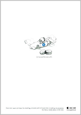 Title: If Formula One were a PC.
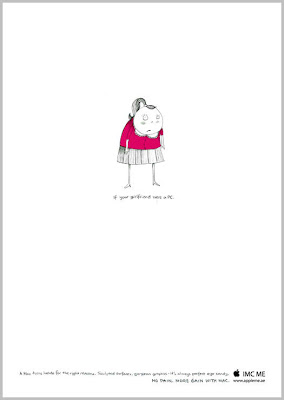 Title: If your girlfriend were a PC.
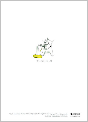 Title: If your pet were a PC.
at
5:00 PM
Labels:
ad,
advertising,
cars,
cool,
creativity,
design,
Dogs,
Dubai,
good idea,
Mac,
middle east,
print
0
comments
![]()
 I can't say too much or it will spoil the surprise. Just visit this shop's site and take your time to look into their products:
at
9:07 AM
Labels:
branding,
cool,
creativity,
design,
good idea,
internet,
marketing,
netherlands,
products,
surprise,
viral,
web
1 comments
![]()
Apparently, last year, TMDG became one of the biggest and baddest events in South America for graphic designers.
It took place in Mar del Plata, Argentina, and more than 5000 visitors attended during three days.
Before the event, designers were invited to ¨customize¨ Converse sneakers and the result was more than 100 beautifully converted sneakers.
The main idea behind this invitation was about the power of ¨free expression¨ but also a possible new design for the brand. One was going to be considered the winner and produced in this year collection.
While I couldn't find the winner, here you can see some of the finalists, or to be more accurate my favorites among the finalists:
1. The "Bunny Attack"

2. The "Green Conscious" one 
3. The "Girl in Hiding"
4. The Darky
Finally, the designers working their "intervention":
If you want to learn more about TMDG (and maybe attend next year), here is the link. Most of the site is in Spanish, English and Portuguese. Enjoy!
at
8:42 AM
Labels:
Argentina,
branding,
converse,
cool,
craft,
creativity,
design,
drawings,
freespeech,
good idea,
sneakers
0
comments
![]()
The New York Talk Exchange (NYTE) is part of the Design and Elastic Mind exhibition at the MoMA.
To reveal the relationships that New Yorkers have with the rest of the world, New York Talk Exchange asks: How does the city of New York connect to other cities? With which cities does New York have the strongest ties and how do these relationships shift with time? How does the rest of the world reach into the neighborhoods of New York?
The answer illustrates the global exchange of information in real time by visualizing volumes of long distance telephone and IP (Internet Protocol) data flowing between New York and cities around the world.

You can see high resolution images and videos at the senseable MIT labs.
OK. I know that their names were not conceived for the Spanish speaking public but for the anglo-saxon market but the US has a large number of Spanish speaking population that most marketers want to tap.
At the same time, we are in living in the "internet era", "global world", "the world is flat moment", etc., etc., what has made the process of branding a bit more complex. That is the main reason why some companies are using more often "naming services": agencies that mostly work on names, focusing on all the possible meanings a name can have in several markets.
These examples are cases where those services have NOT been used and the names selected have horrible connotations or meanings in Spanish.
First case:

Webon is pronounced EXACTLY like Huevón or Güevón, that in Spanish, depending the country means stupid or lazy (in just two small countries in Central America means something good, as in Nicaragua and Honduras huevón can mean "brave", but for all the rest of the Spanish speaking, huevón is an insult).
Now, Webon (the product) is a new service from Lycos, that aims to provide among other thing a blog-building service. I am not sure about others, but as a native Spanish speaker I do not want to have a blog that includes in its url the world word webon. Sending that url to friends and family that are also Spanish speakers would be like asking to be teased.
Second Case:

This is one site I really like. To be fair, the name is in fact MoCo Loco and MoCo is for "Modern and Contemporary". The site is focus on design: Nice site, nice products, all very stylish and presented with great taste.

(Sigh). What can I say? This was the title of a posting at Gizmodo.
iAno apparently is an application to convert your iPhone in a piano. Problem is that "Ano" in Spanish means "Anus". So iAno does NOT sound good, no matter what. I don't care what the application can do, it still sounds horrible...!
These are not isolated cases. There are many (many) more to showcase. I promise I will, but meanwhile if you have something to share, please send it this way!
"If they can't see it your way, is time for Obay" reads the packaging of these (fake) pills for kids that are part of an advertising campaign in Canada.
The teaser worked pretty well and for a while everybody was trying to guess who could be the client for such a strange message. Funny enough some were thinking "Scientology".
With brand communications in general is not so odd to find either a brand, a logotype, an ad or sometimes even a slogan that you can't help but to think "What where they thinking when they approved THIS?".
Here, some examples:
1. The design of the logo should have empahatized how this name has to be read. Of course is "Kids Exchange" and it is NOT Kid Sex Change or Kid Sex Exchange, but the design doesn't make it clear.

2. The design for Brazilian Institute for Oriental Studies, that also promotes the "cultural exchange", can be seen as promoting some other type of exchange:

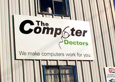


I have been waiting for a long time for an ad where the copy is all nonsense garbled and mix on that you could read (if you really try) some statements about why the copy is garbled and whatever is needed to say about the product.
Would be something like:
Ioioioio, Ipse Lorum, Whyacareatoawriteaanythinghereaanyway? Ifbwebknowbnobodybreadsbthebcopybanymore. Andcmorecblahcblah, thiseproducteisemustehaveforeblahblah, Ioioioio, Ipse Lorum.
Why? Because there is so many people out there saying "nobody reads the copy anymore" that I am not sure why in hell ads have any copy at all or agencies spent any money in copywriters.
I don't agree with that statement. I read the copy in almost any ad that catches my eye. OF COURSE, they have to catch my eye first, but if they got my eye, I will read the copy. And I used to read them before I even get into advertising. So, maybe we are few now, and maybe, just maybe, we are entering into the Ice Age for people like me that reads and maybe we will all disappear soon. But so far, we are still here.
I guess that is why I like this ad. I know that in this case they are talking about the title and not the copy and that half of the joke is that the car is too eye-catching to read the title anyway. But at some level I feel there is also a subtle reference to "nobody reads the copy anymore".

From the Canadian Advertising Agency Open Minds
at
6:46 AM
Labels:
ad,
advertising,
agency,
canada,
cars,
copy,
creativity,
good idea,
readings,
title
0
comments
![]()
 My small collection of bones, skeletons and skulls is nothing compared to what you can find in this
 site.
site.
From great ideas for Valentine's Day (or Vladentine's maybe?) to windows that look like skulls, Skull-A-Day is a place to visit for those who -by any reason- are attracted to the symbol of "to be or not to be".
Yeah, that would be me. And yes, I still have some stories to share about my grand-grand-grand mother skull and me.
But not today... I am eating my chocolates while finishing my crosswords!

at
9:06 AM
Labels:
creativity,
I like it,
internet,
odd,
skeleton,
skull,
trip over,
web
0
comments
![]()
This is a very usual thing at my home. And is not just me. Is the same with Glenn.
And sometimes I think that if the dog would know how to type he would be doing the same, considering his tendency to fight....
Yes, there is little sleeping at home. There are sooo many "wrongs" on the internet!
See more here, Via Boing Boing (yeah, I am having a Boing Boing day today)
I have been trying to avoid here the topic of the upcoming elections, because the moment I open my (big) mouth I am usually seen as a cynic. My problem is that because of my experience and formation, it doesn't matter who I like, I see them as products anyway.
And I am pretty good at telling who will they get votes from considering their 'positioning' or if the communication of their brand is adequate for the target their aiming.
So I look at them, their public speeches, their manners (and mannerisms), their slogans and their websites as I would do with any other product. I see packaging (McCain and Hillary have some problems there), I see brand, positioning and "promise of the brand".
You have probably seen already the Obama video, Yes We Can.
Now, check out the mixed that someone made for McCain. Is a parody of course, but I believe a small part of his target is probably ok with those statements and probably see nothing wrong in that positioning.
Let's compare them side by side...
Now, the parody; McCain - Bomb Bomb Iran
Is not only what the "products" are... is also how they are perceived. And more, way, way more importantly so, is how the 'consumer' feels when choosing that product.
If the whole campaign was based in just these two videos, who do you think will win (and where)?
Via YouTube and BoingBoing
at
8:19 AM
Labels:
advertising,
branding,
democrats,
GOP,
McCain,
Obama,
politics,
propaganda,
slogan,
TV,
TVSpot,
video,
voting
0
comments
![]()
This design that won an honorable mention at the "Re-Invent Design Competition" organized by Procter & Gamble and Design Boom, seems in fact like a very neat idea for the product.
at
7:54 AM
Labels:
awards,
branding,
cool,
creativity,
design,
funny,
good idea,
house,
Italy,
packaging,
perception,
recycle,
sports
1 comments
![]()
I thought that God had something against the "Apple".
But maybe that was the old guy, you know, the one from the Old Testament. And I guess that now the son, as part of the new generation, has a different view and in fact has his own... podcast?
Here is the ad:
Is not a joke. If you visit their site (Saint Matthew-in-the-city) you can see the section dedicated to the podcast under the same name. I guess is true that this particular parish is "A progressive Anglican church with a heart for the city & an eye to the world".
But.... an Apple and God in business together? That is not just a "progressive church" is almost a blasphemy! (I would just love to know who is playing snake this time around).
Found in Picasa
at
12:13 AM
Labels:
ad,
advertising,
Apple,
atheism,
Australia,
creativity,
God,
IPod,
marketing,
media,
popdcast
0
comments
![]()
 Some time ago I showcased here some of the Good Old Days of TV advertising when a family oriented cartoon could be the face for a cigarette's brand and beer in the Hospital was just a nice way of celebrating the newborn.
Today, Asylum (the only thing from AOL that I stand visiting) has a great gallery of old and antique print ads that from our modern point of view are completely politically incorrect.
Not only you can see a baby praising his father for choosing Marlboro over other brands ("Gee dad, you always get the best of everything...")but a husband spanking his wife over the grocery shopping was totally acceptable (sadly, still is in some places, apparently).
Of course these are good examples of how much our views can change over anything. Most of those products have not changed at all but our point of view has changed dramatically. Going through the ads, you will also see doctors recommending Camel and pregnant women being able to do their work again (cooking) thanks to some new medicine!
But now take a look to some products...
At least in one case, the product is even more interesting than the ad. I am talking about the "Sanitized Tape Worms" that were advertised as a was of losing weight without dieting.
I guess that trying to find the easy way to be thin is not new. But the "sanitized" part of the product really cracks me up!
Check the whole collection at Asylum.
at
8:54 AM
Labels:
ad,
advertising,
babies,
beer,
branding,
creativity,
oldie,
PC,
print,
products,
smoking,
violence
0
comments
![]()
As I have said before, I am a bit compulsive when it comes to reading, I read everything that crosses my sight.
The very first time I saw this sign I was at the Miami Airport at the small Starbucks "stand" they have there. I was waiting for my coffee when I saw a very similar sign across the waiting area, in the wall right were employees were preparing my coffee.
While "employees must wash hands..." is pretty common, I was struck by the step-by-step indications on HOW to wash your hands. At that moment I was without my camera and I thought that was an opportunity that I've already lost.
Luckily, last weekend when we went to Miami to adopt Lola (our new baby dog that is driving me crazy and the only reason I am awake and blogging at 7:30 am) we stop at another Starbucks and when I went to the bathroom, there it was.... the "How to Wash Your Hands for Idiots" sign.
I didn't have a good camera with me, just my cell phone. So this is the best I could do. If you can't see the explanations below, those images are a reminding of the complex sequence needed to properly wash your hands (the American way):
1. Wet
2. Soap
3. Wash for 20 secs
4. Rinse
5. Dry
6. Turn off water (with paper towel)
As you can see, this sign is disturbing at many levels...
On one hand I am still shocked by the fact that employees employees at Starbucks can understand statements like "A Venti Frapuccino Mocha Latte Light" but can't remember how to wash their hands...?
On the other hand, the order and the details in the instructions are another sign of the so extended American germophobia and their general disdain for the worldwide lack of water: you can rinse, turn off the water and then dry. Your chances of contracting a horrible disease are not really so terrible higher by changing the order and you can save some water in the process.
Last but not least, let's face it: if you really need reminding instructions on how to wash your hands maybe your genes shouldn't survive anyway!
 This is not really a new product, but they have been including more and more stuff and it actually can be very therapeutic.
...Or how it could have been if the original "aborigines" were the white guys and the roles between conqueror and conquered were swapped.
This is not a new but a rather old movie from Australia (1987) that I haven't seen yet, but I like already how it was named:
Babakiueria comes from what the "conquerors" understand when they asked how that place was called...it was the "Barbecue Area" and therefore Babakiueria was born.
A sarcastic look at racial stereotypes, Babakiueria was awarded the United Nations Media Peace Prize in 1987. Here is the beginning of the movie:
at
7:29 AM
Labels:
Australia,
creativity,
funny,
movies,
odd,
perception,
racism,
sociology,
TV,
video
2
comments
![]()
Trust is a brand of preservatives that commercializes in Africa and apparently they needed to make a point about the sizes that were available.
So they came up with this ad, that may not be the more subtle but at the same time gets the point accross what in this case is the most important thing considering the spread of AIDS in Africa. At the same time the acting and the music makes the commercial enjoyable to see.
at
2:54 AM
Labels:
ad,
advertising,
Africa,
condom,
creativity,
sex,
TV,
TVSpot
0
comments
![]()
 Who would think that Bush Jr. could become the poster boy for anything?
But after seeing this Swiss campaign (reminding people to use helmets when riding their bikes so they can avoid brain injuries as apparently has happened more than once to Jr.) is easy to realize that EVERYONE can be the poster boy (or girl) for something. It just depends what that something is about.
Now, you can say that is an easy target. Ok. Maybe.
Still it is a good example of why this canbe considered the land of opportunities..., as it reinforces the idea that even a moron can become the President. But the campaign acts as a warning at the same time: if you are not the brightest in the bunch and you still make it to that position, beware, you WILL be mock all over the world.
As you can see in this other poster from the same campaign, the quotes used are real ones -the type that has become known as "Bushisms".
What I really like is the fact that in their technical file, when it comes to the copywriter, Bush gets its credits (Advertising Agency: Ruf Lanz, Zurich, Switzerland; Creative Directors: Markus Ruf, Danielle Lanz; Art Director: Grit Wolany; Copywriters: George W. Bush, Markus Ruf)
Now, to be totally fair with Bushito and the ad agency at the same time, we have to point out that this is not the first time that this brand have used a political public figure to convey their message. Their previous "Prince Charles" campaign won a Silver place at the Epica Awards in 2007. And that piece was also mocking the Prince, not for his IQ but for his spenfing habits. Take a look.
You can check more about the Swiss Bush campaign at Adverbox , or browse all the winners of the Epica Awards here.
at
6:03 PM
Labels:
ad,
advertising,
awards,
Bush,
creativity,
funny,
print,
sports,
Switzerland,
UK,
USA
0
comments
![]()
I love rocking chairs and I find really unfair the fact that they are seen as "old people" furniture. I don't think this would be the case:
This is a concept reading chair with an integrated light placed just above the readers' viewing area. Design based on a wheel by Mathias Koehler. A chair to read, yes, but also to Rock and Roll!
Via Treehugger
at
4:20 PM
Labels:
cool,
creativity,
design,
furniture,
good idea,
light,
likeit,
readings
0
comments
![]()
 Forget about Iraq or Iran. The next war will be over Saturn's Moon, Titan.
With about 20 percent of the moon mapped, scientists have estimated several of the lakes on Titan each contain more than the total amount of natural gas on Earth, something around 130 billion tons. That means the orange moon has hundreds of times more liquid hydrocarbons than all the known oil and natural gas reserves on Earth.
Now, some ultra-classified-information may lead to believe that some very dangerous WMDs have been spotted there too. It may be 750 million miles away from Earth, but since when distance is an obstacle for oil companies or to start a war? Forget Iraq, forget Alaska, let's go invade and drill Titan!
Via Discovery Channel
 A very ingenious ad for a hairstylist.
Not only makes it pretty clear that there are several ways you can have your hair cut but also it catches the eye of anyone inside the mall.
The Client is Juice Salon from Mumbai and the Agency is REDIFFUSION DY&R.
at
6:46 AM
Labels:
ad,
advertising,
communications,
cool,
creativity,
good idea,
guerilla,
India
0
comments
![]()
at
8:34 PM
Labels:
crazy,
driving,
Florida,
living in the US,
personal,
random thoughts
0
comments
![]()

Is just my opinion, of course.
You can create your own message at Despair.com. Or you can have fun with the rest of their products.
No, this site has not become a gossip site from one day to the other, is still mostly about advertising. But is a fact that a big number of stars, starlets and very good actors too, have started their career acting for TV commercials and most of them keep doing it when they have already became famous (for more money that's all).
That seems to be the case of Brad Pitt, who has been doing ads for Heineken, Rolex and Toyota among other brands. Most of those ads are for markets outside the USA.
Now, he has a new commercial in Germany. Sadly I don't have it with subtitles and my German is not good enough, but apparently the idea is that Brad Pitt’s bike runs out of gas and he goes to this family’s house to use the phone. The girl in the family is a big fan of his, so the mom tells her she’s not going to believe who is there. The mom then tries to get Pitt to stay more time with them by telling him how great their phone service is and getting him to check his e-mail too, even when Brad's German seems to be as fluent as mine (we both understand "DSL" and "email").
Here is the ad:
Good advertising normally needs to work in a place in between being too literal and being too "intellectual". Apparently, whoever came with the idea for this pharmacy in Russia, didn't know or didn't care about that. Now, even if you don't know ANYTHING about creativity there is this thing called ¨common sense¨ that could have been useful when making the decision..., I truly believe that common sense would indicate that this is not only too literal but it can also be seen as too aggressive (I can't imagine trying to convince a kid that the shots in this place are not going to be painful!).
On the bright side, I am sure it makes the place easy to find and a good reference when giving driving directions: "once you passed the pharmacy with the HUGE syringe, take a left...".
Maybe that is how the owner wanted it, easy to spot and easy to recognize, no matter the negative connotations the sign may have!
Found in EnglishRussia
at
3:28 AM
Labels:
ad,
advertising,
bad idea,
creativity,
Russia,
signs,
street
0
comments
![]()
Yesterday I came across this old campaign for Teflon, from a Singapore-based agency called 10AM-Asia. I really like the ad, I think is ingenious and reinforces what the product is all about. In fact it also won some awards here and there. But then, in an afterthought, I realized that either this is an ad for a very VERY neat city, or it has the lifespan of a fly. I mean... in most of the cities I know that (faked) fried egg on the floor would have turn into an absolutely disgusting thing in less of half a day. And after that you would not be able to see that there is an egg there and therefore the whole joke is gone.
I have been in Singapore many many (MANY!) years ago and I don't remember it as a very clean city. Maybe that has changed or maybe this was located in very strategic locations.
If by any chance our friends in Singapore know anything about this campaign like for how long it run or how well the eggs stay in view, please let us know! :)
at
1:27 AM
Labels:
ad,
advertising,
Asia,
awards,
billboard,
creativity,
good idea,
outdoors,
Singapore,
Teflon
1 comments
![]()
Each time I go back to Argentina, I make sure visit some jewelry designers. While I do jewelry myself, I don't enjoy doing rings as much as I enjoy doing pendants and funny enough what I use more (and I change more often) are rings. So if I go to Buenos Aires, I spent some time looking for cool rings as I know I will find them there.
I have one or two 'fixed' favorites that I try to visit each time I go but one of my greatest pleasures is to find the new ones, those new -very creative- designers that are experimenting and creating with new materials or new techniques.
Below you can find samples from both worlds:
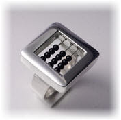


The two smaller pictures in the middle are from Nueveveinticinco, already an established name that is worth a visit every time. I have several rings from them and they always got attention, as they tend to be really different.
The bigger pictures are from relatively new designers, that I've found visiting "Puro Diseño" (an event that showcases new/young designers) and also through friends that know my weakness for good jewelry design. The bracelet at the top is a design from Juana Marana, that works most of her pieces 'knitting' silver and other metals. The other ring is from Gabriela Horvat, someone that has made of working with curves almost her signature.
These are of course a few, but there are so many more available! If you like good design, creativity and new trends, make sure you schedule a trip to Buenos Aires. Is a big city and it may seem chaotic but as I used to tell my students "at the beginning is always the chaos and from then on is creation" (and even when I am not religious, lets face it, even the Bible says so...!).
If you are asking yourself if Argentina has anything to do with Argentium (a type of silver), yes, they are related by the simple fact that the name Argentina comes from the Latin word "Argentum" that means silver. By chance or by destiny, who knows, Argentina is one of those perfect spots to find really cool hand made silver pieces.